Use case walkthrough: Adjust Incident Display ►
Incident Management has lots of ways to adjust display settings so you can work the way you want. Let’s take a look.
We’ll go to the incidents page.
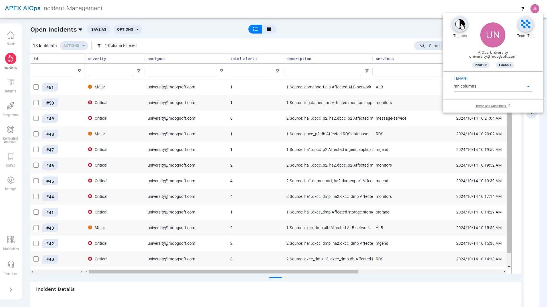
You have a choice of light theme...
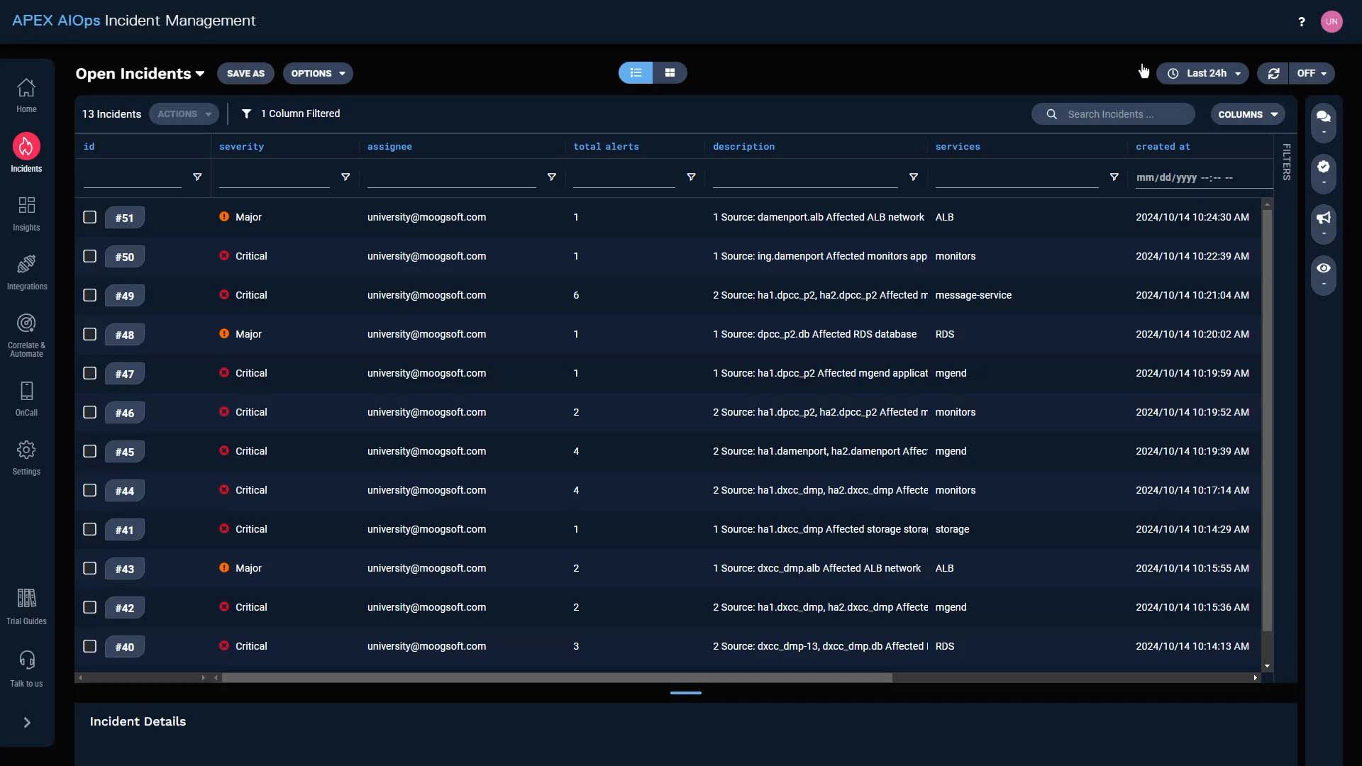
...or dark theme.
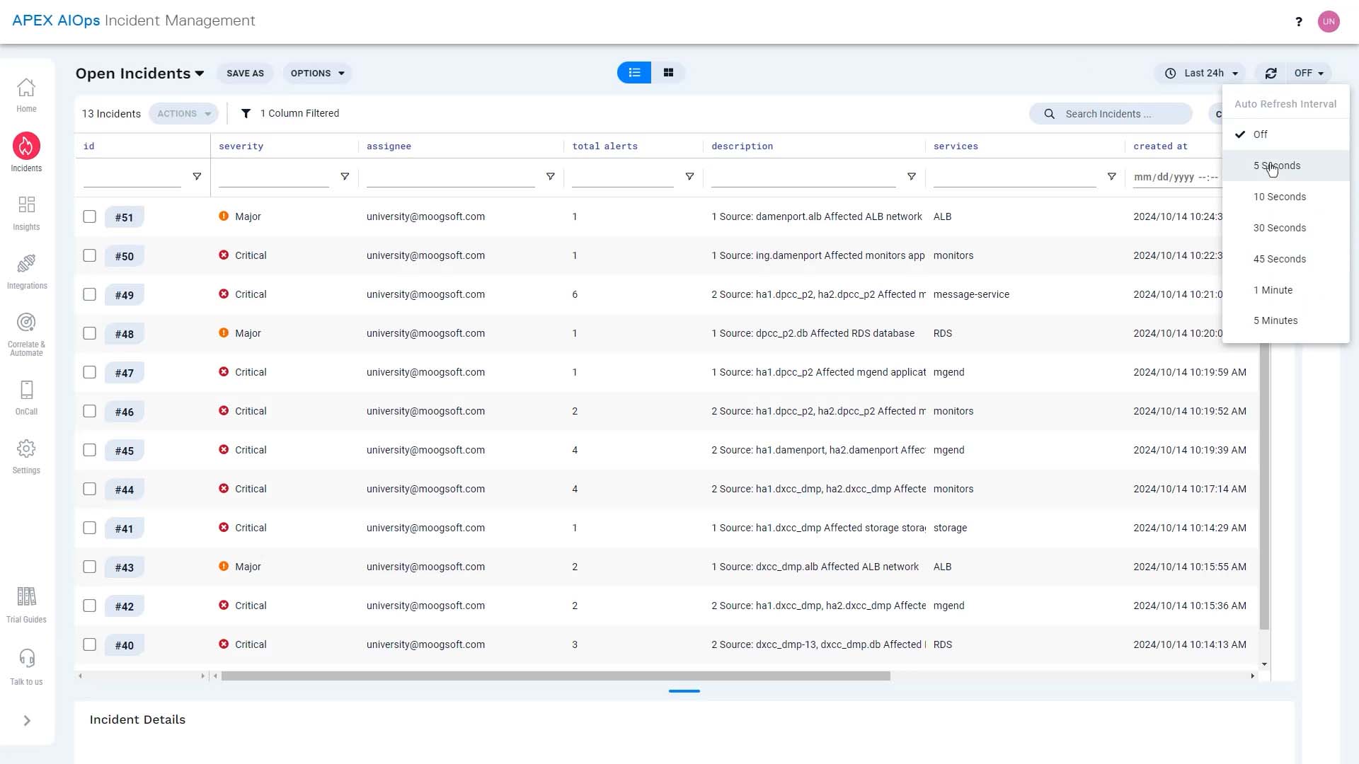
You can choose to refresh the display manually or set up auto-refresh.
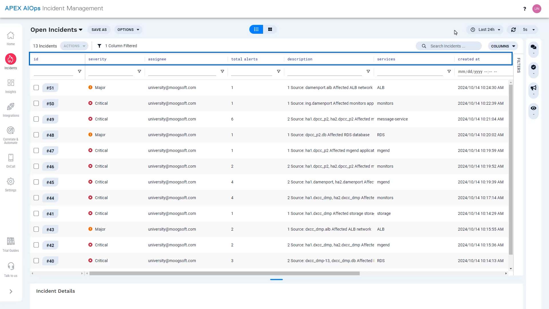
Incident Management shows these columns by default, and you can see more if you scroll right.
But there are more incident attributes available.
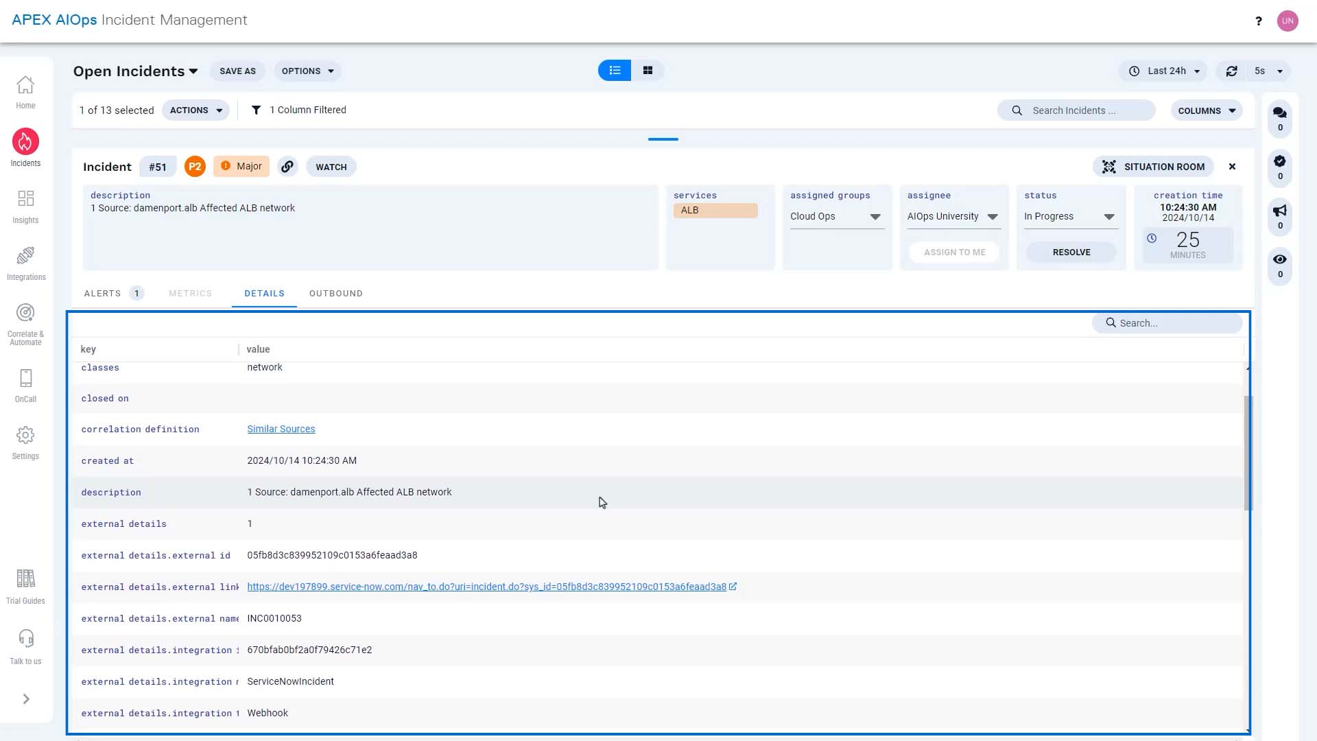
What if you want to see different columns on your screen? No problem!
Go here to choose what you want to see.
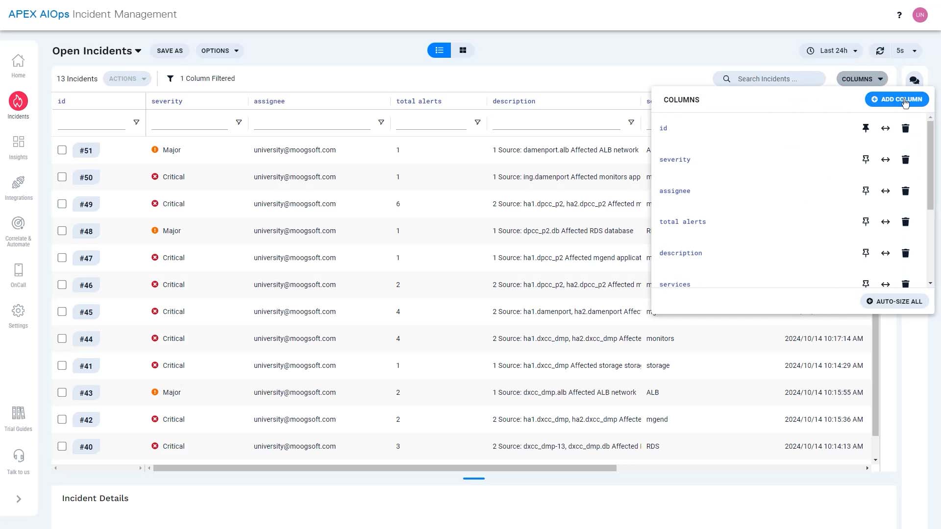
We’ll add priority.
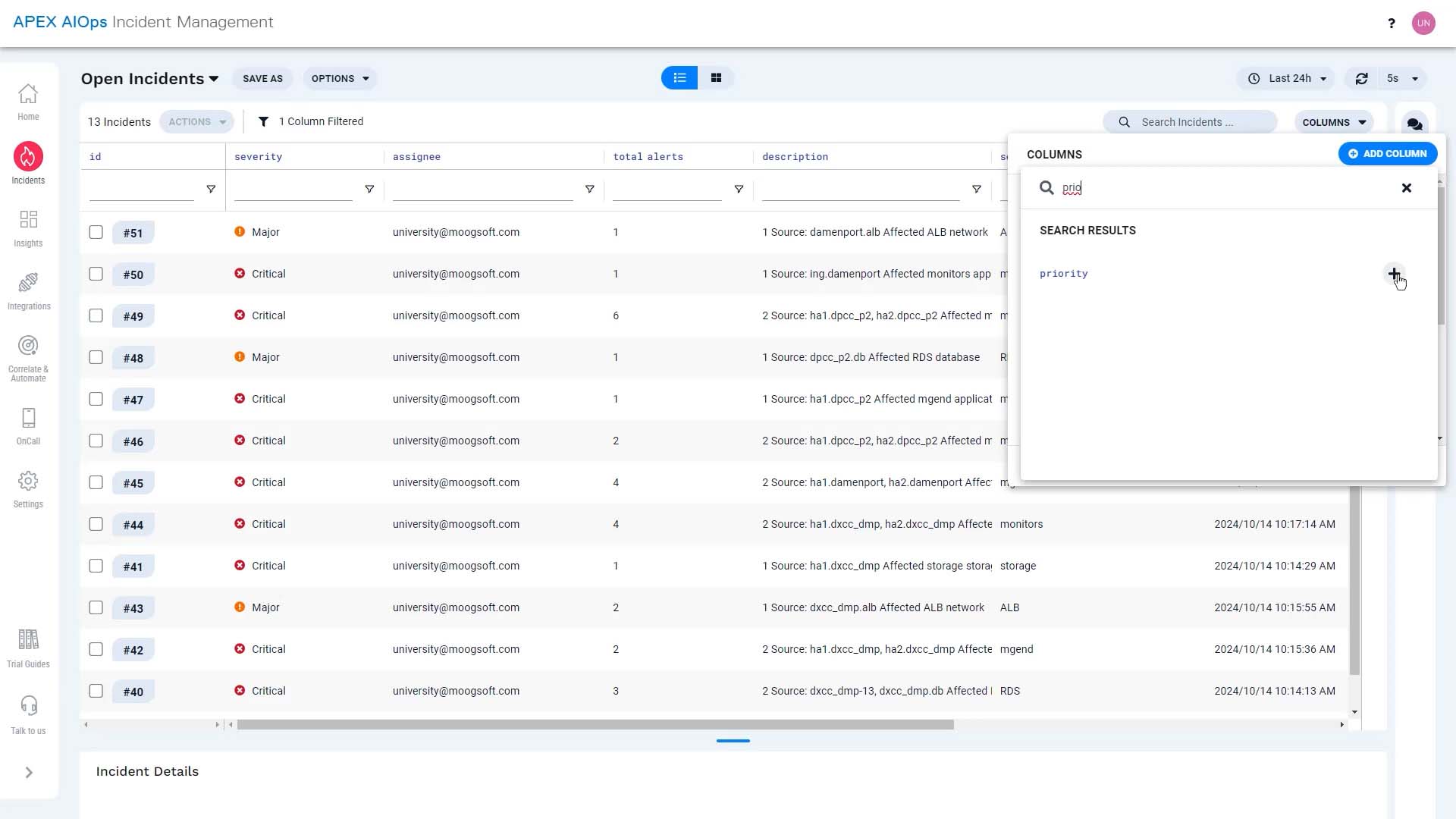
Our configuration has an outbound integration to a ticketing system, so let’s get the external link column as well.
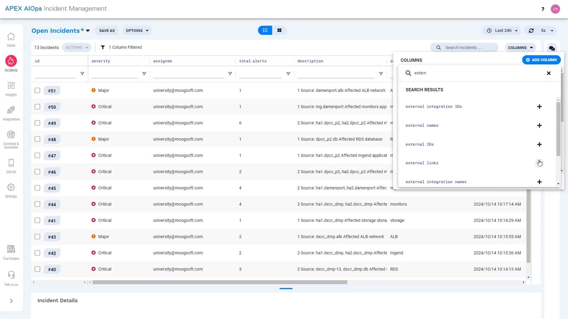
And let’s show a column for assigned groups.
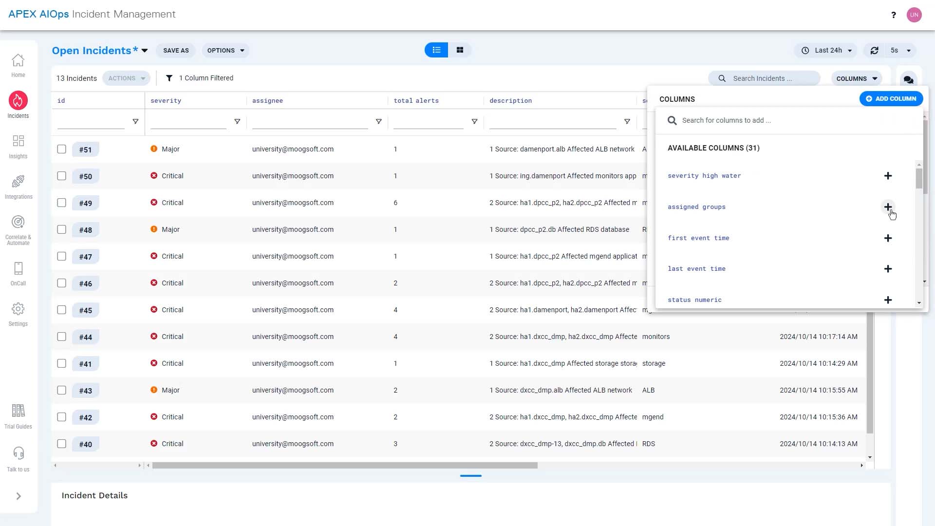
Done.
You can see the id column is pinned. This will keep it on the left of your screen.
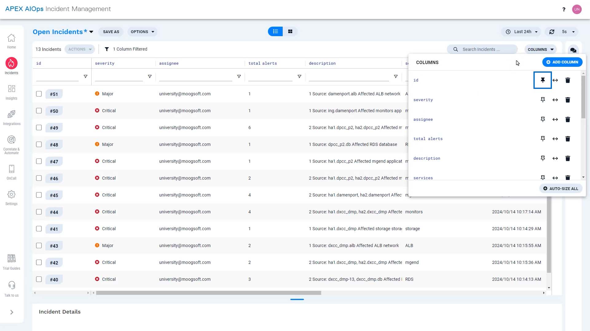
Let’s pin priority and severity, too.
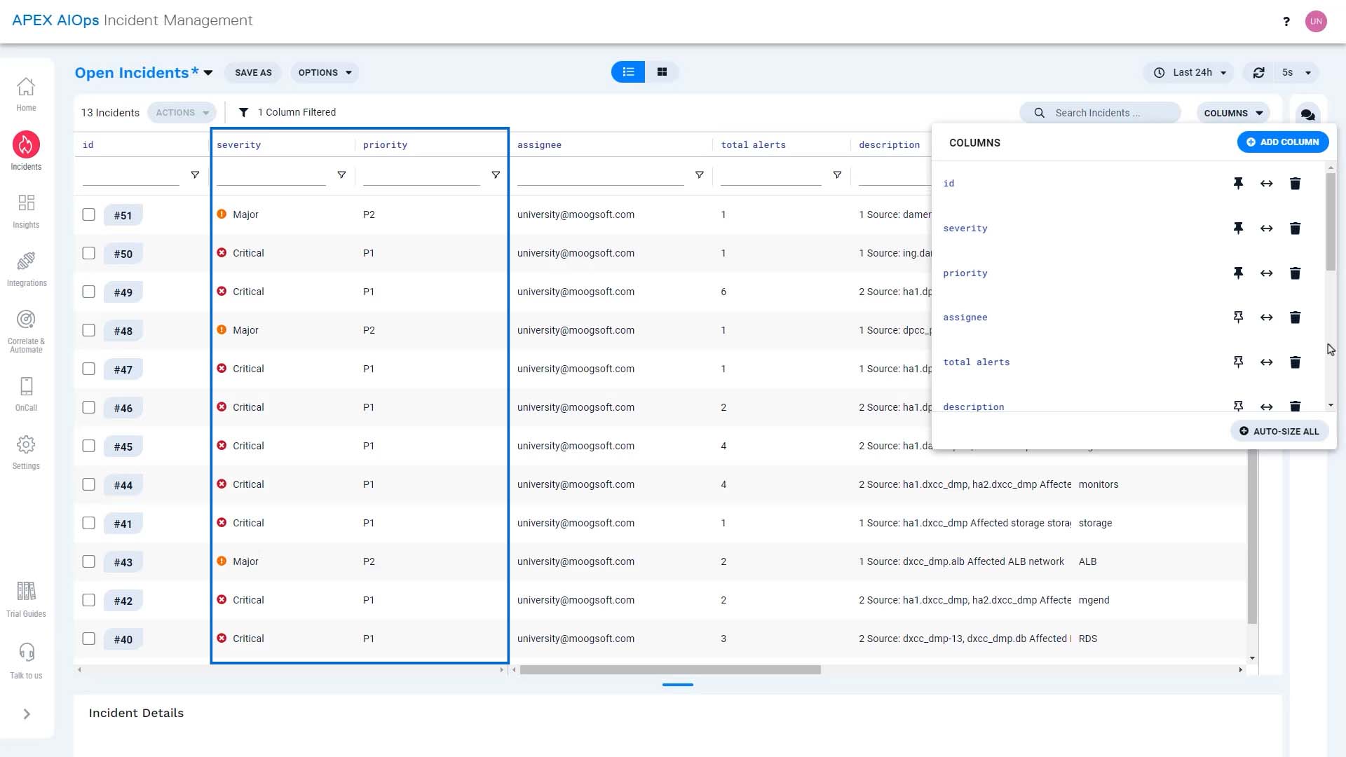
And we can tidy up by autosizing the width of the columns.
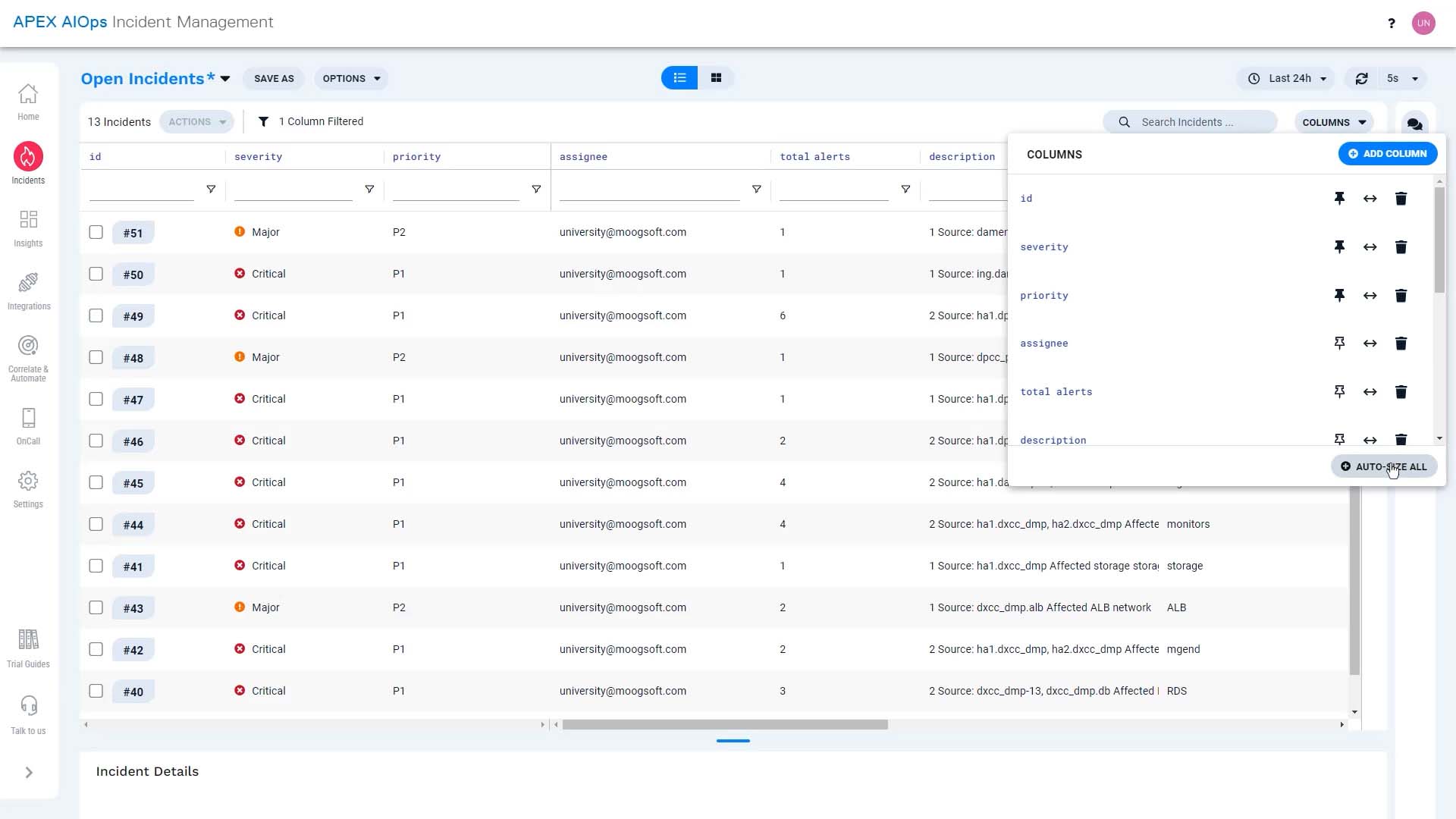
We can adjust width manually as well.
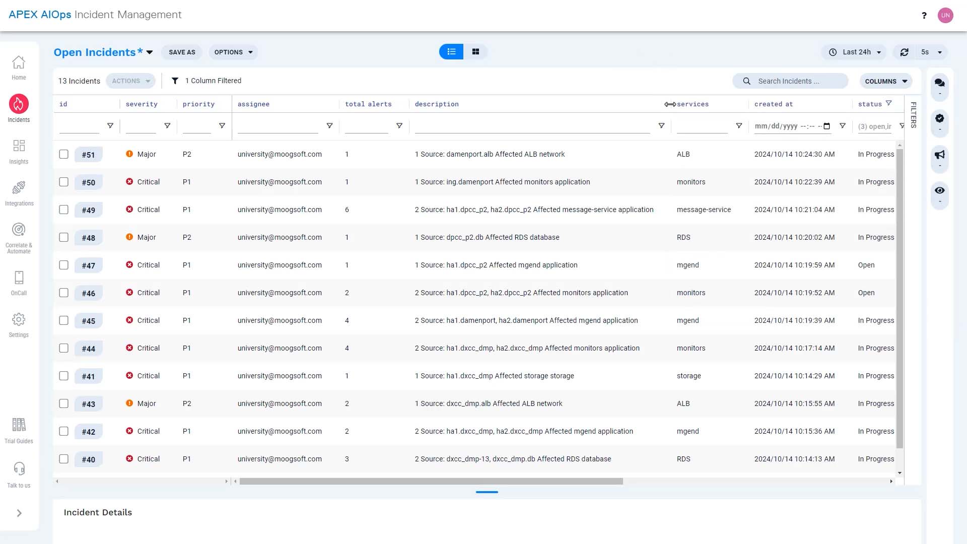
And we can move columns like this.
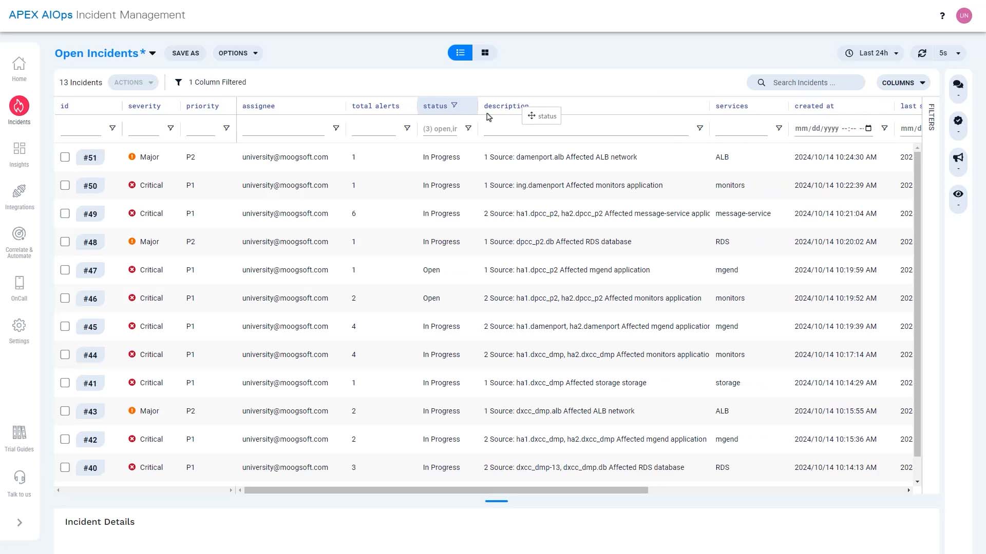
That’s better! Now we can focus on the incident details we want to see. Let’s save this view.
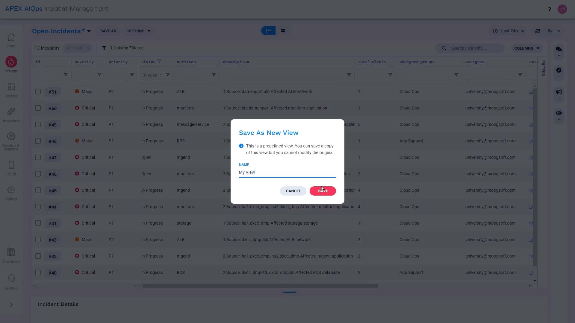
Now the columns are set up, What if we want to narrow down the incidents we want to see? No problem!
We can choose a different time frame here…
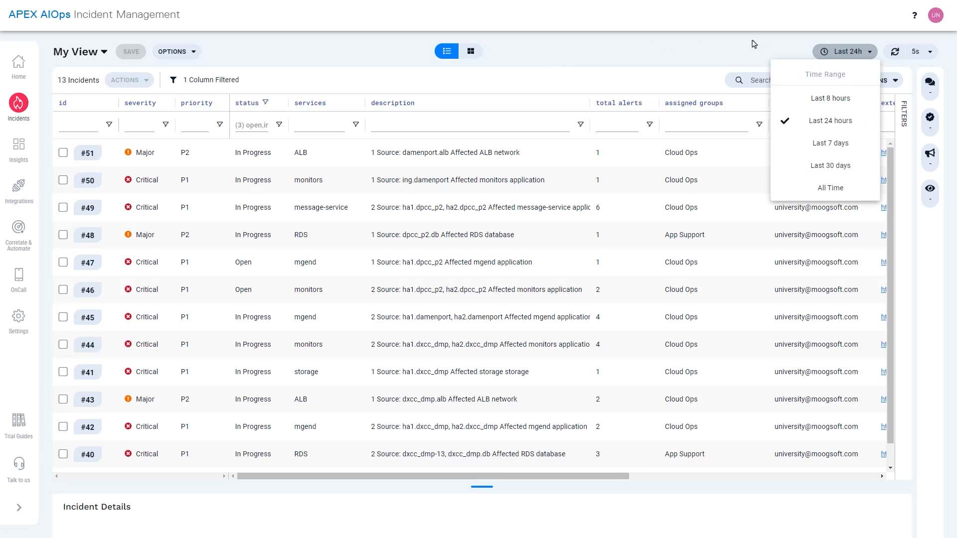
...sort any column in ascending or descending order…
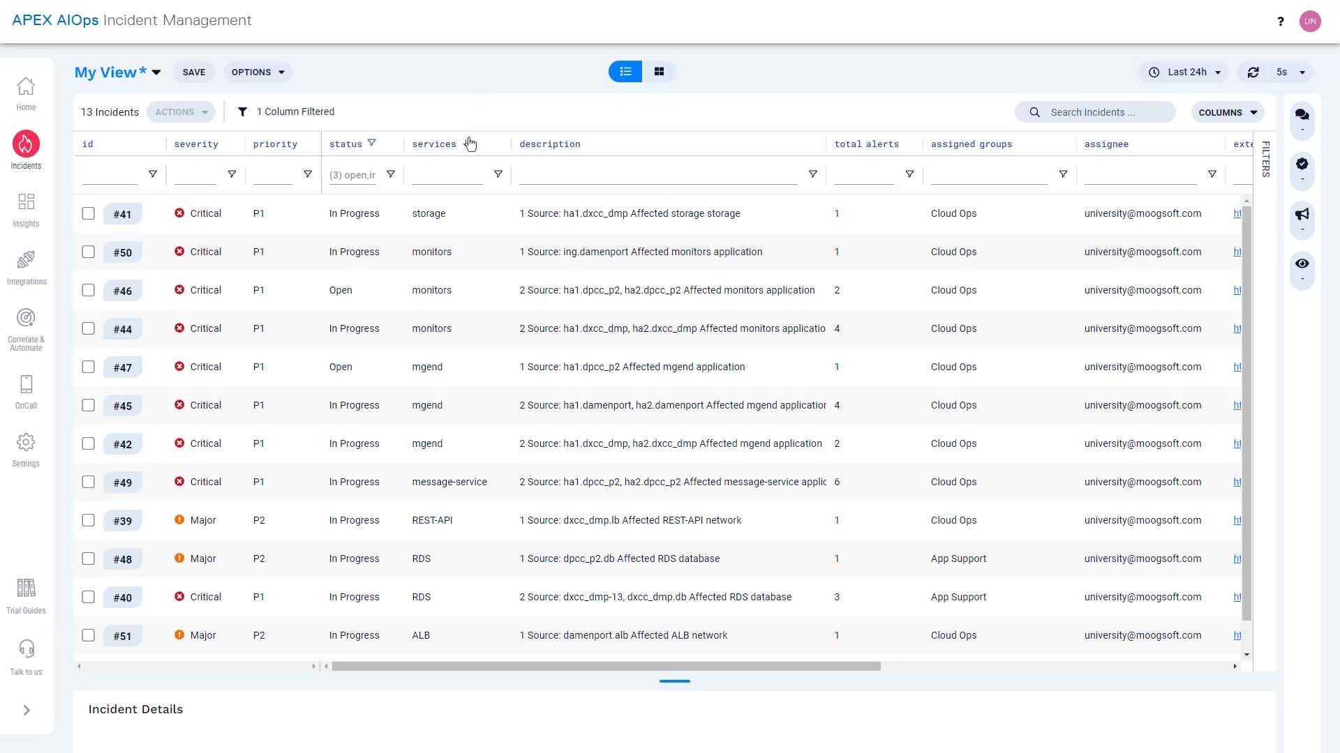
…and do a multi-column sort by holding down the shift key.
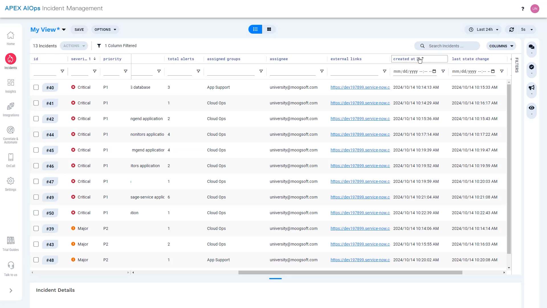
Incident Management has powerful filtering capabilities, too. You can filter here at the top of each column.
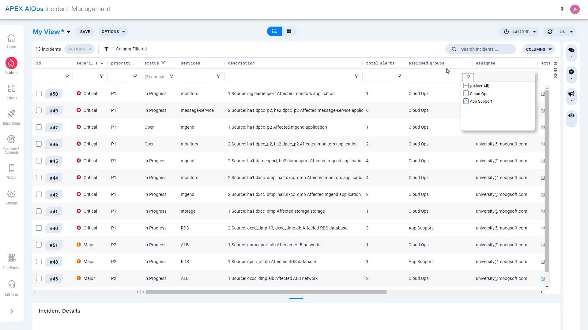
You can clear filters like this…
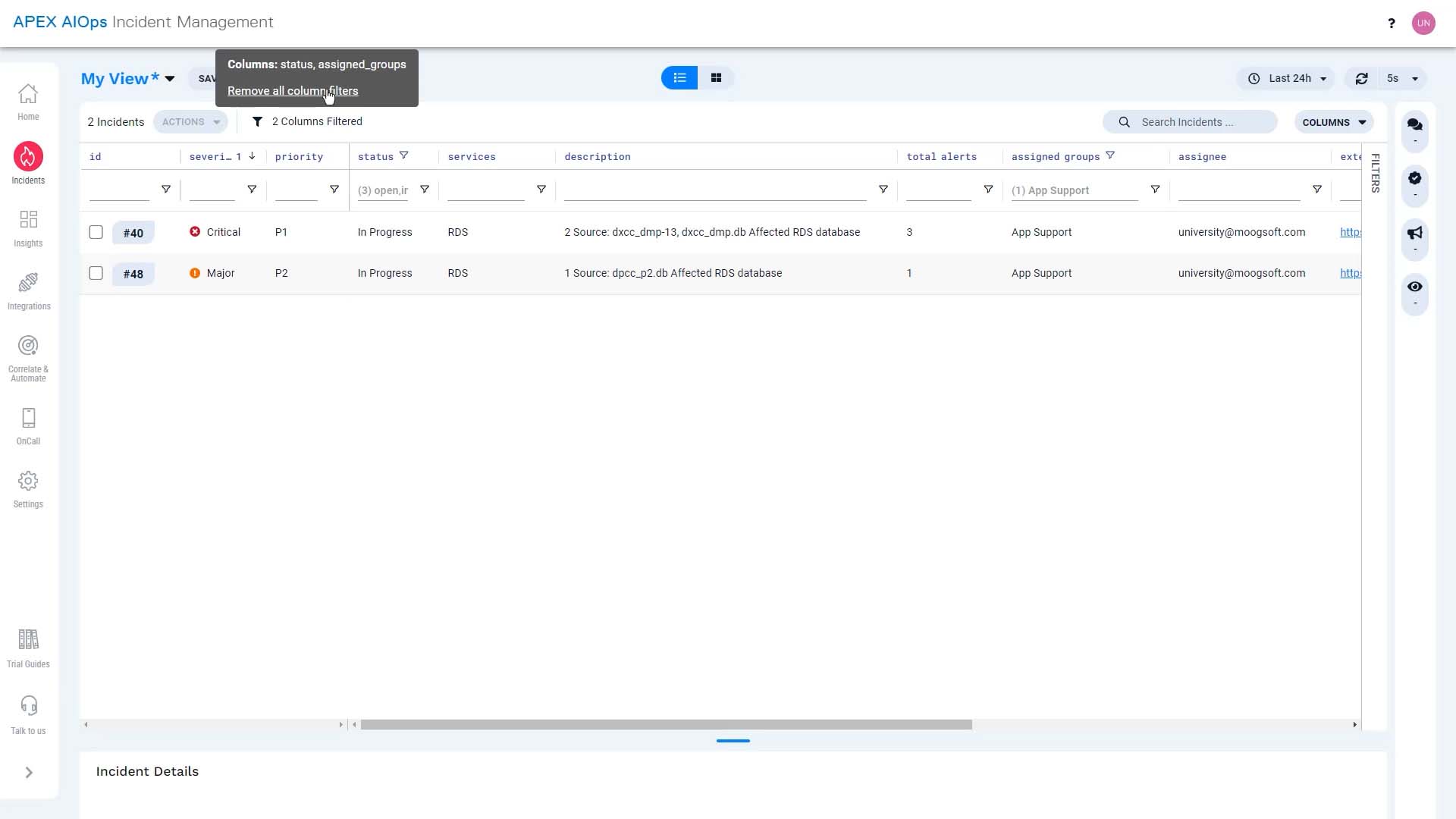
…and you can set up a more complicated filter in the filter panel here.
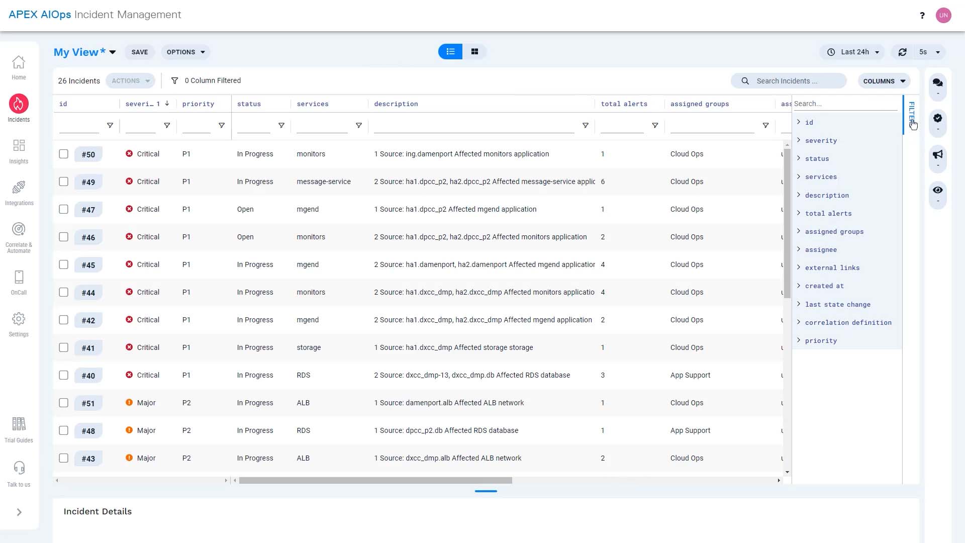
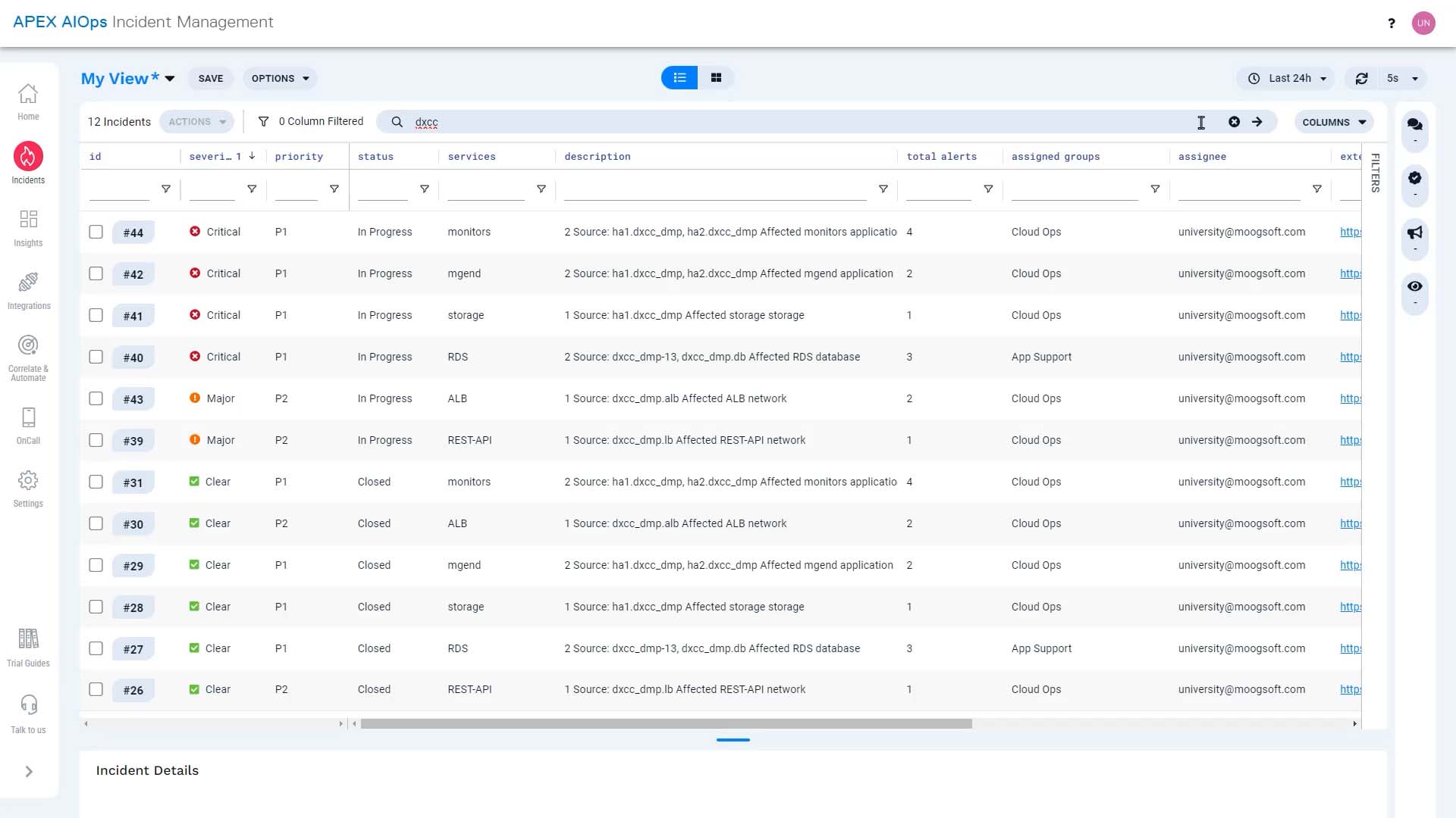
You can also search to find incidents with specific text.
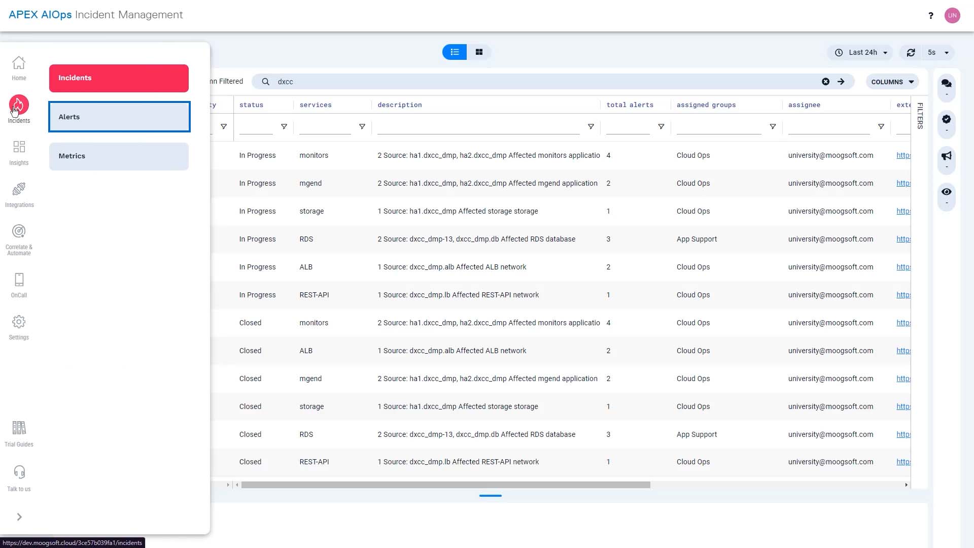
All these operations work for alerts, too.
Now you know how to adjust the incident display so you can work the way you want. Thanks for watching!