Metric chart reference
The following diagrams and tables detail the features available in metric charts.
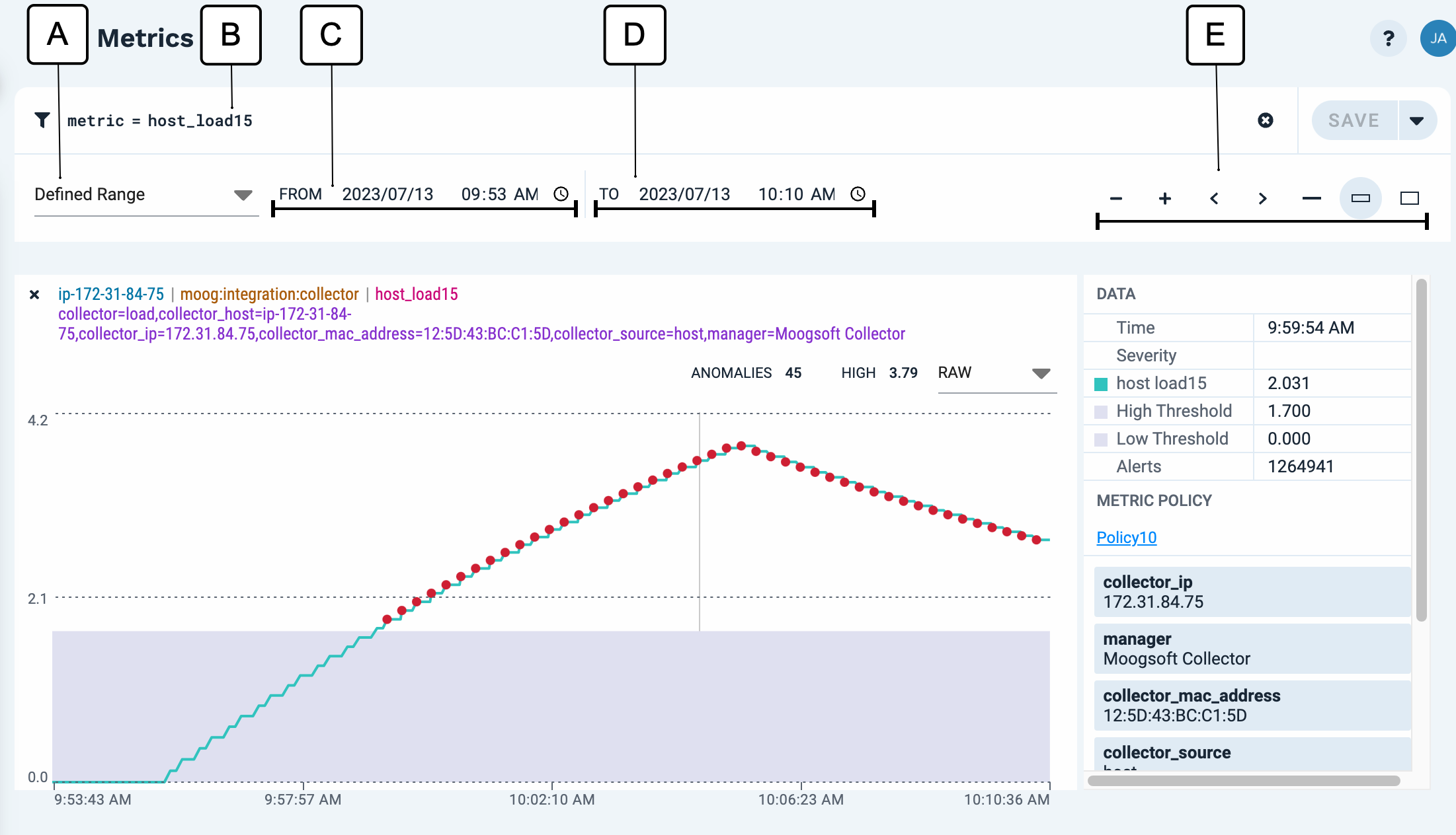
Chart controls
The controls at the top of the page let you change the way all the charts display:
 |
Callout | Description |
|---|---|
A | The time period displayed in the chart. Possible selections include: Last 10 minutes, Last 30 minutes, Last hour, Last 6 hours, Last day, Last week, or Defined Range (user-selected time and date). |
B | Scope query |
C | Start of time range displayed |
D | End of time range displayed |
E | Chart controls
|
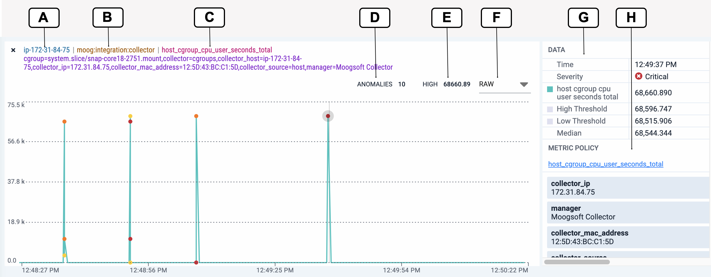
Chart information reference
Each chart includes the following:
 |
Callout | Description |
|---|---|
A | The source node for the metric. |
B | The fully-qualified name of the managed object that defines the configuration settings for the metric |
C | The name of the the metric displayed in the chart |
D | The number of detected anomalies in the current time window. |
E | The highest data value within the current time window. |
F | Set the aggregation view:
|
G | |
H | The name of the policy which was applied to the metric. |