Executive Summary overview
The Executive Summary page includes a high-level dashboard overview of the activity in APEX AIOps Incident Management. This feature shows at a glance how well operations are functioning overall, with drill-downs to provide more in-depth detail when needed.
Navigate to Insights > Executive Summary to view the dashboard.
Change the time period displayed by clicking the time selector at the top right of the page and selecting an option from the list.
The Executive Summary page is composed of these sections:
Noise Reduction
This area shows how effectively Incident Management is reducing noise in your environment.
The different sections of the screen include quick links to different areas of the application, where you can view additional information or make changes. Hovering over each statistic includes a quick refresher explaining the measured item, plus links to other areas of the application that can provide further details.
Events
The number of events received during the selected period. This is the raw data received and is generally a large number.
Hovering over Events displays a link to Inbound Integrations, where you can see a list of integrations.
Alerts
The number of alerts created from deduplicated events during the selected period. Because alerts are created from events this number is smaller than the number of events.
Hovering over Alerts displays a link to the Alerts page, where you can see a list of all alerts.
Incidents
The number of incidents correlated from alerts. When Incident Management is configured effectively, this number is greatly reduced from the original number of events.
Hovering over Incidents displays a link to the Incidents page, where you can see a list of all incidents.
Deduplication
The percent reduction in events by combining similar events into alerts.
Hovering over Deduplication displays links to Integrations and Event Workflow.
Correlation
The percent reduction in alerts by grouping related alerts together into incidents.
Hovering over Correlation displays a link to the Correlation Engine, where you can change correlation settings to improve the way incidents form.
Noise Reduction
This figure represents the overall reduction in noise between the received events and the final number of incidents, made possible through deduplication and correlation.
Hovering over Noise Reduction displays links to Correlation Engine, Integrations, and Event Workflow, where the system can be tuned to further improve this figure.
Operational Performance
The operational performance section lets you view trends within your organization.
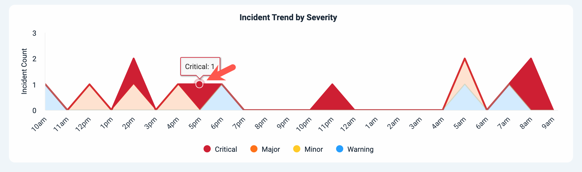
Incidents Created by Severity
Use this chart to view the number of incidents and their severity over time.
Incident Created by Severity can show you if the number of incidents overall is trending up or down over time, if there are clusters of incidents at particular times, if incidents of a particular severity are increasing or decreasing, and other trends.
To view the incidents included in a particular severity category at a particular time, click within the colored band, and then click the dot that displays at the top relating to the time you want to view. This opens the Incidents page and shows the incidents represented by this chart area in the Incidents page.
 |
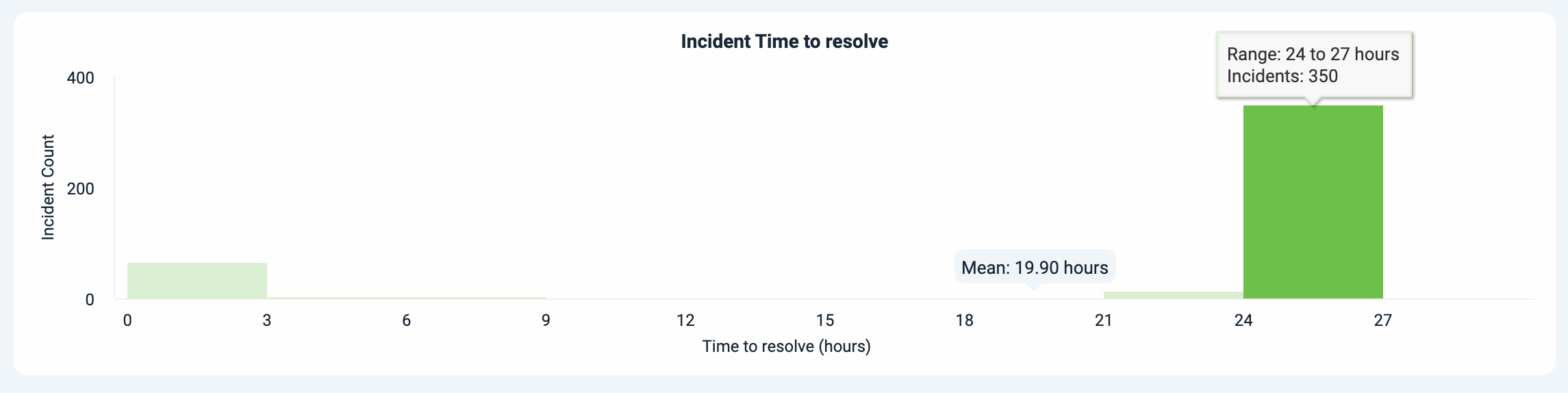
Incident Time to Resolution
Use the Incident Time to Resolution chart to view how quickly your teams are completing work on incidents.
This incident count vs. time to resolution chart lets you see how your incidents are categorized by resolution time. Are most of your incidents resolved quickly, or do they cluster at the higher end of the time range? For your organization, what constitutes a quick to resolve incident? How slowly are the longest incidents to resolve taking to close? You can find the answers using this chart.
Get more detail by clicking the bars in the chart to see all of the incidents for that resolution time range. You can compare the incidents taking similar amounts of time to close and potentially find common root causes between them. This data can help you strategize ways to reduce MTTR for similar incidents in the future.
 |
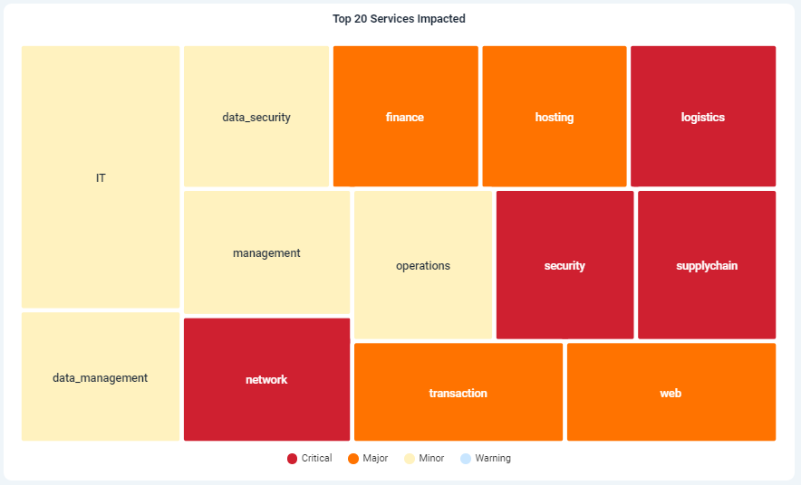
Top 20 Services Impacted (or Top 20 Sources Impacted)
Use this chart to view the top 20 services or sources impacted over the selected dashboard time period. Click the title to open a menu and switch between viewing services or sources.
This chart lets you quickly assess the most affected services or sources across your system based on incident count. Each service or source is depicted as a square, with the size of each square proportional to the number of incidents associated with the service or source. The color of each square reflects the maximum severity of the incidents impacting the respective service or source.
To view the incident count for each service or source, hover your cursor over the related square.
To view all incidents associated with a service or source, click on the related square. This opens the Incidents page and shows the incidents associated with the selected service or source in the Incidents page.
 |