Use metric charts
Metric charts show visual representations of ingested metric data using data points and lines, with color-coded dots indicating anomalies. The initial Default Metric Policy is configured to store all ingested metric data so that you can view it in chart format.
Access metric charts
Navigate to Incidents > Metrics.
Enter the metric information to view in the form of a query. For details, see Search and filter metrics.
If the chart does not display, it is possible that your query did not match any metric data. Try using different parameters to change the filter.
NOTE: If you query in invalid, you will see the message "No Matching Results" in place of the chart.
Close charts using the X in the upper left of the chart to allow additional charts that match the same filter to load.
Change metric chart size
The number of charts you can view at the same time depends on the size selection. You can choose to view small, medium, or large charts. Charts appear in the medium size by default.
Use the chart size controls at the top right of the page to change the chart size:
 |
Zoom in on metric chart data
You can zoom in on a specific area of the chart by clicking and dragging your mouse to select it. When you release the mouse button, the view changes to the selected area of the chart.
Open a chart displaying metric data.
Hover over the line near the time where you want to begin zooming in and click the charted line.
Hold your mouse button down, drag to the end time of the area of interest, and then release it.
The chart is now zoomed in on the selected section.
You can also use the + button in the chart controls to zoom in. Similarly, the - button zooms out.
Display a custom time range
You can select the latest time span to display in your chart, or you can display a time range of your choice. A custom range is useful if you know an anomaly occurred on a certain day at a particular time and you want to see the details.
To view recent data, click the menu under the query and select the time interval to view.
Possible selections include: Last 10 minutes, Last 30 minutes, Last hour, Last 6 hours, Last day, Last week, or Defined Range (user-selected time and date).
Select Defined Range to view the data for a custom time interval:
To change the starting date, click the currently displayed date after FROM at the top of the chart. Select a new starting date using the calendar. Use the same procedure to select a different end date by clicking the date displayed after TO.
Change the start and end time times by clicking the clock icon to the right of the displayed time and using the selector to choose a new time.
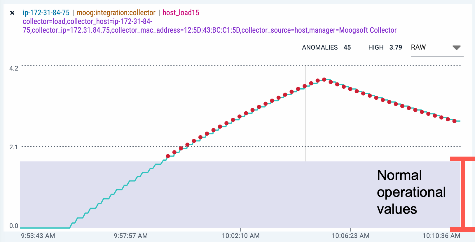
Interpret anomalies
Color-coded anomalies display as dots in charts. Zooming in on times where multiple anomalies appeared close together can help to separate the individual anomalies.
The color of the dot indicates the severity of the anomaly:
Color | Severity |
|---|---|
red | critical |
orange | major |
blue | warning |
green | clear |
yellow | minor |
purple | unknown |
Purple (unknown severity) indicates that a newly enabled metric policy with an adaptive detector received an event, but it has not yet gathered enough data to complete learning mode and determine whether the event is an anomaly.
To view the value of a specific data point, hover over the point in the line with your mouse. Details in the Data area, to the right of the chart, update with the values. Click a point in the line to view the information in the raw datum for that data point.
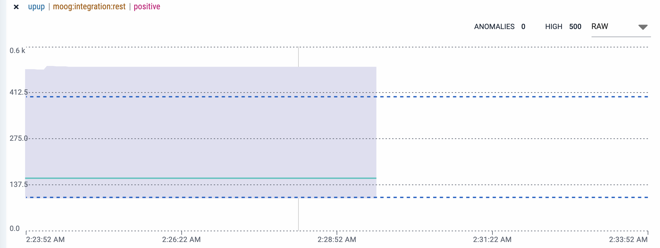
View the band of normal operating values
The area of the chart which indicates the normal operational values displays as a gray band. This area is either between calculated high and low thresholds (adaptive detector) or fixed high and low thresholds (threshold detector). Data points occurring outside of this range are considered anomalies, although this can be altered by using confidence zones in a metric policy with an adaptive detector.
 |
If the policy used in the metric chart includes an adaptive threshold with a confidence zone, the chart includes a dashed blue line representing the confidence zone in addition to the normal operational band:
 |