Use case walkthrough: Power of alert correlation ►
This video steps through a use case example to showcase the power of alert correlation in Moogsoft Cloud.
We’ll troubleshoot a sample incident to see the power of alert correlation.
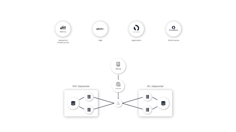
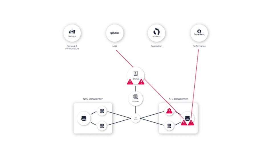
Here’s a simple setup that we’ll be using for our demonstration. We have a few different sources that are sending data to Moogsoft.
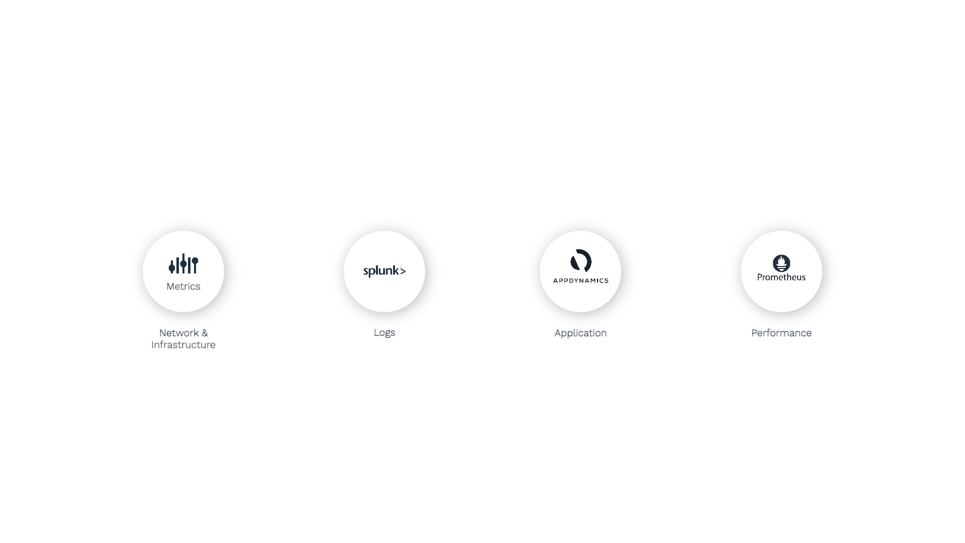
For starters, we’re ingesting metrics using the Metrics API. Moogsoft is data agnostic, meaning that these metrics can be of any type, and can originate from any source.
We’re also using Splunk for logs and analytics, AppDynamics for application performance monitoring, and Prometheus for database and infrastructure performance monitoring.
And here’s what we are monitoring.
We have a three-tier, customer-facing application called Billing that relies on databases in Atlanta and New York.
One of the switches in the Atlanta data center experiences some degradation - maybe some packet loss - which impedes the communication between the application server and database.
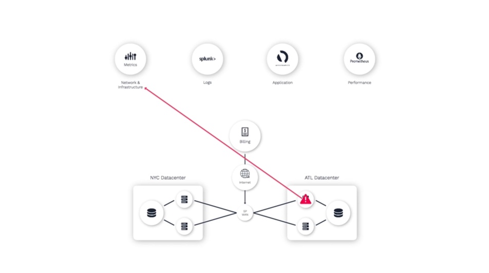
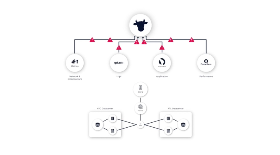
Since all three of these domains are monitored by different teams using different tools, we’ll see application alerts...
Database alerts...
And network alerts.
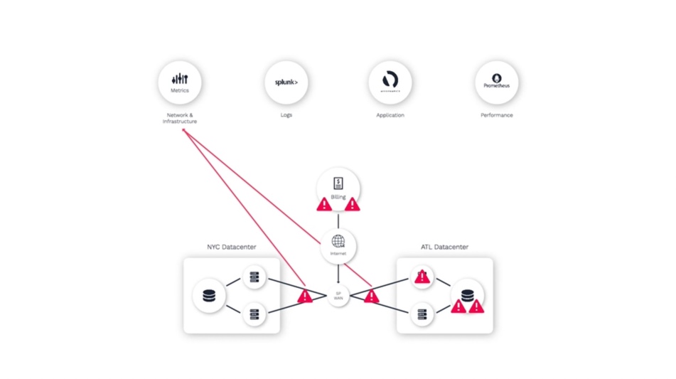
As an operator trying to resolve this problem, they often don’t have visibility into what other teams are seeing in their monitoring tools. So it takes time to synthesize your analysis of what you can see, with the insights from others.
That’s where Moogsoft comes in. Moogsoft identifies related alerts and groups them together, organizes them into relevant incidents, and presents these incidents with rich context, making it easy for us to identify the underlying problem.
Let me show you what I mean.
Here is the Incidents panel, where we’ll start our triage efforts.
And this is the incident you’d get for the scenario we just went over.
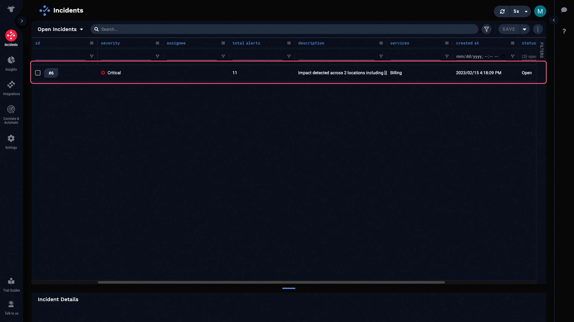
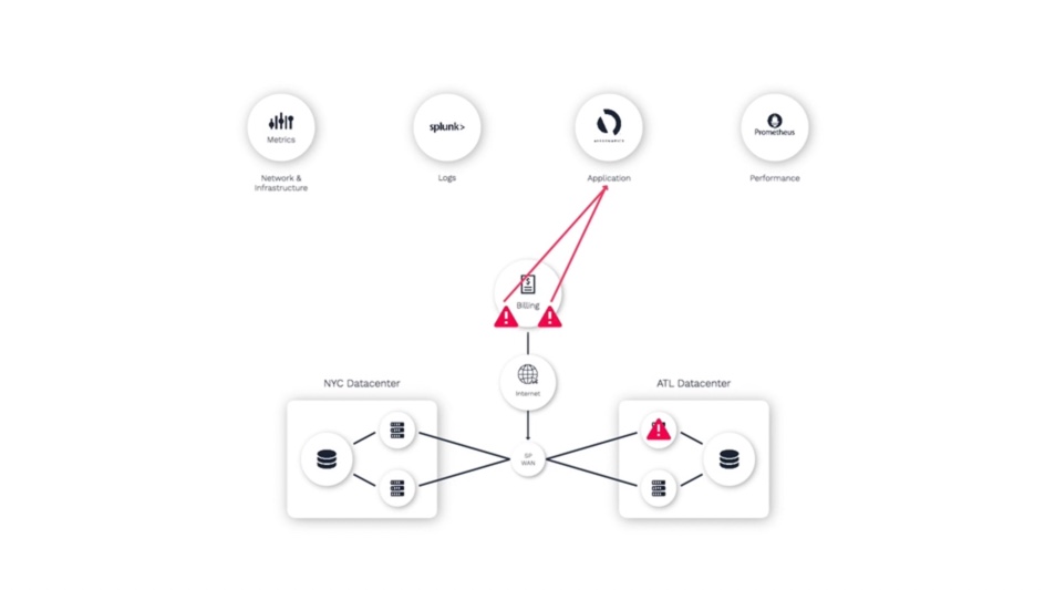
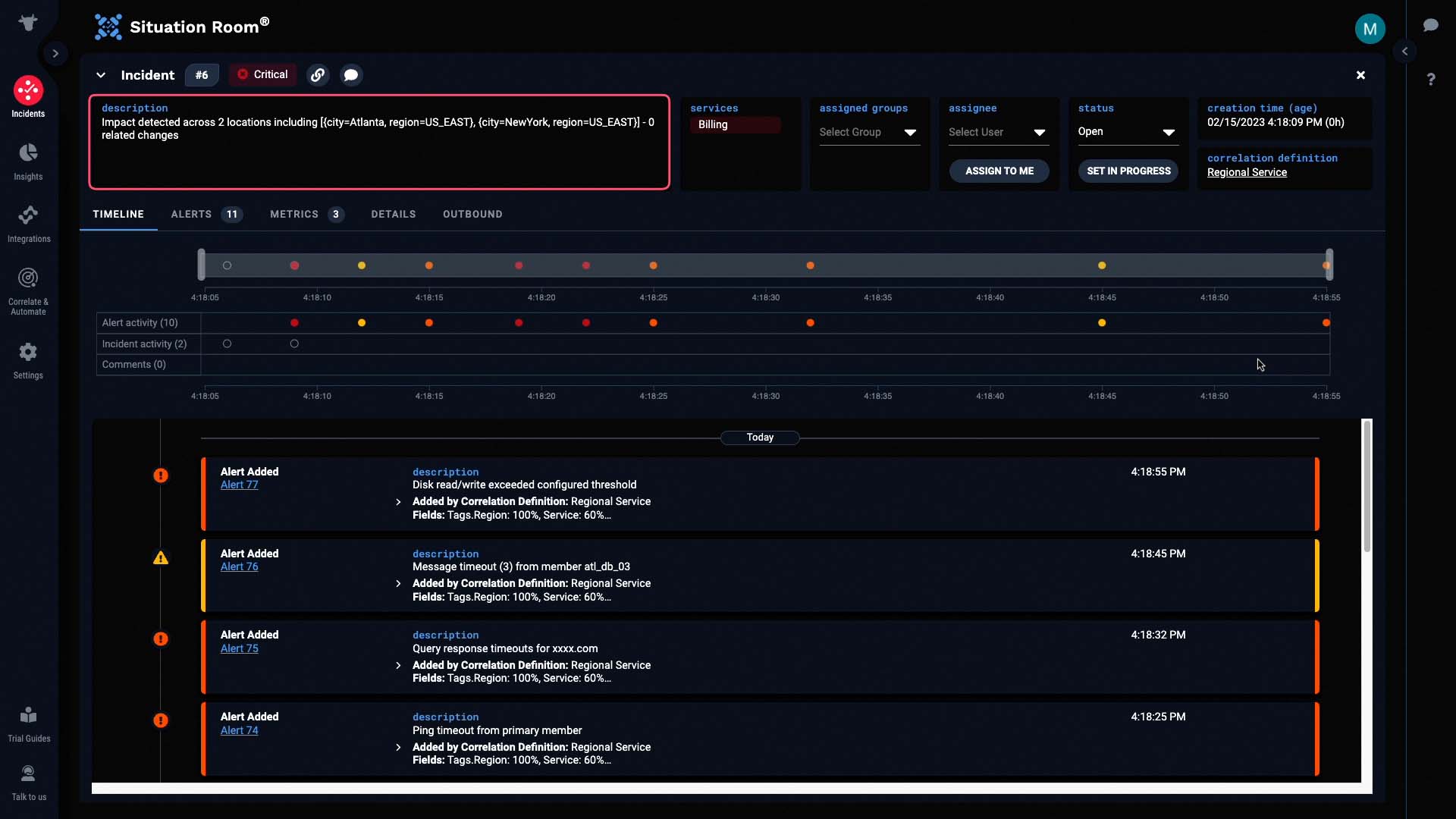
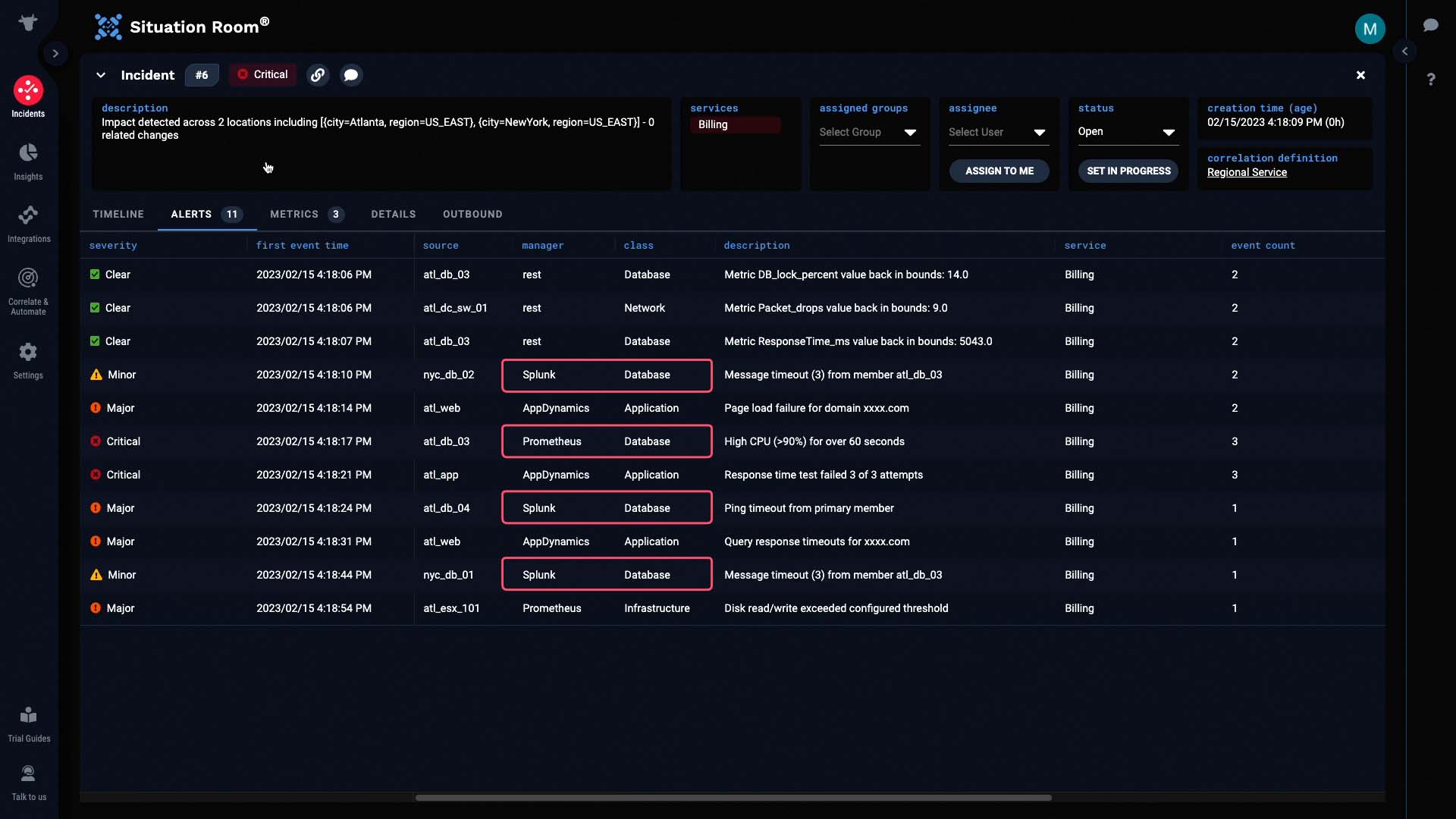
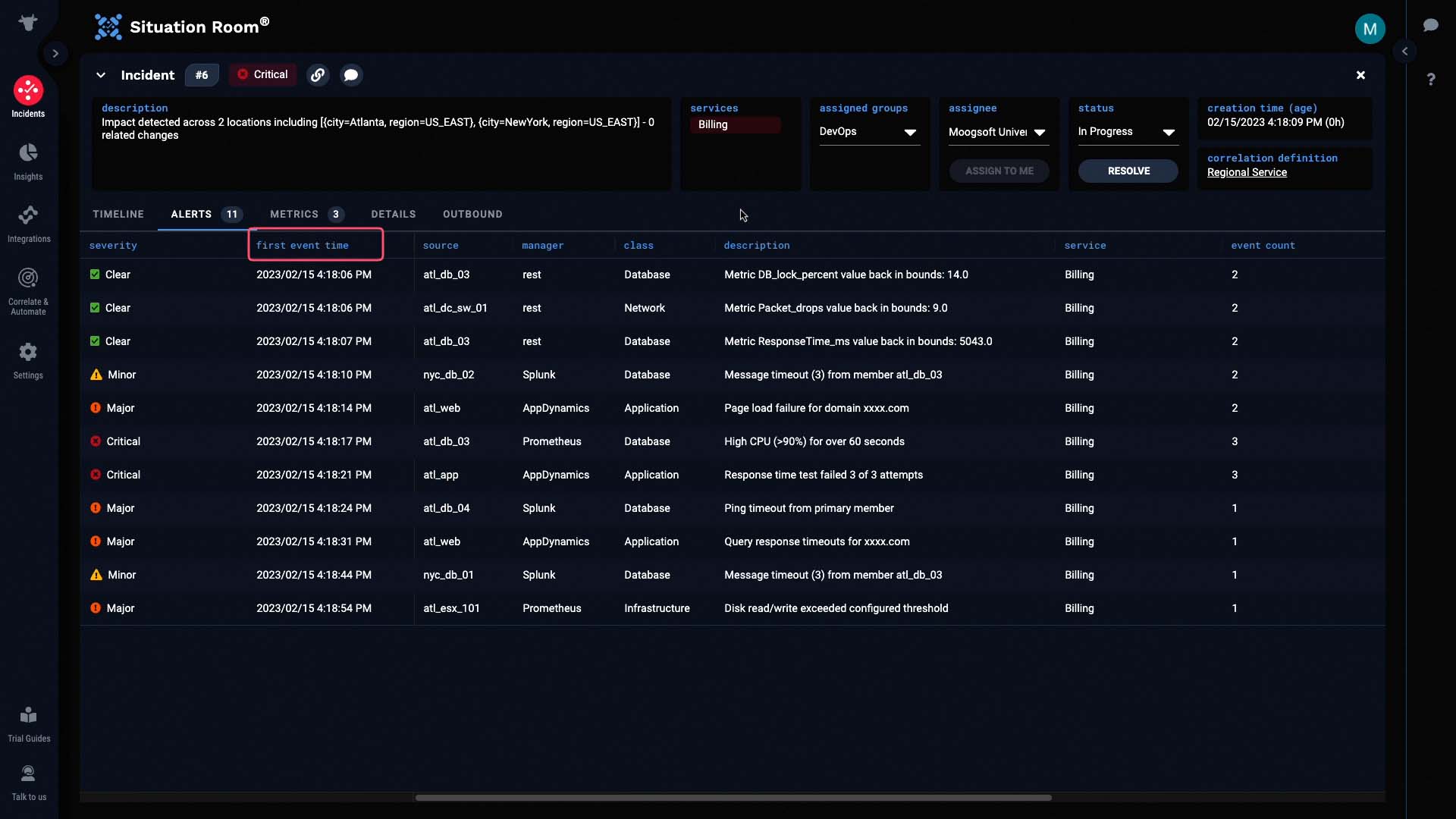
Let's go into the Situation room to discover more. The service impacted by this incident is Billing...
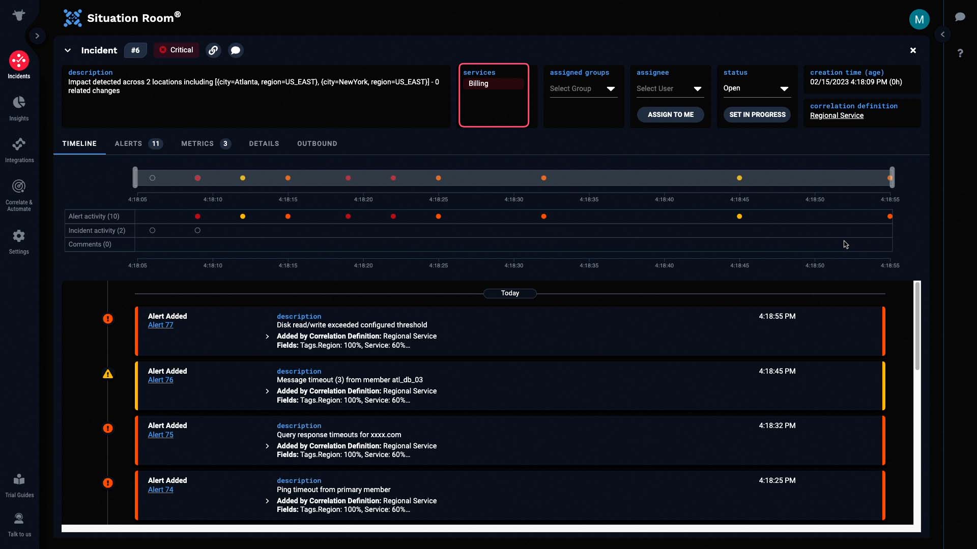
And the description has been dynamically populated to tell us the critical information - in this case, the locations affected by the incident.
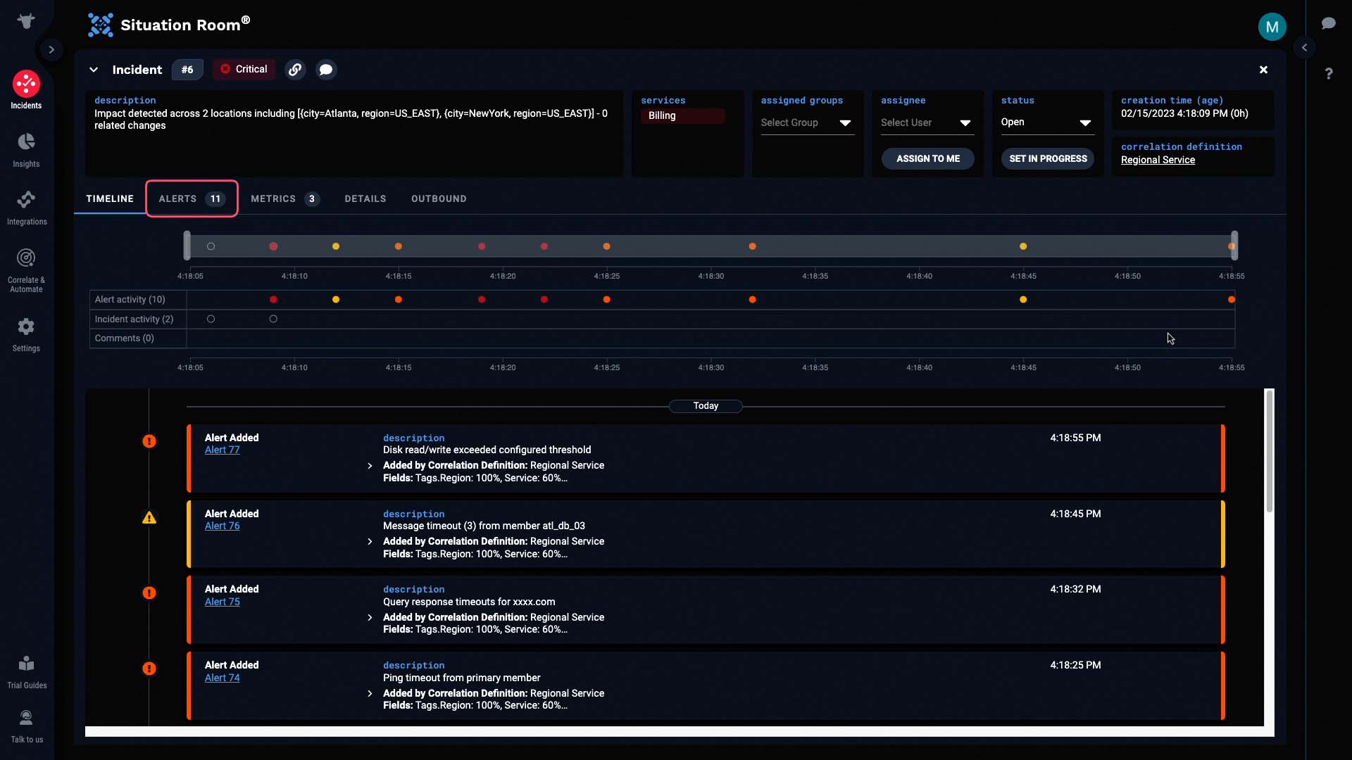
And this incident contains 11 alerts. No doubt, these came from all four data sources.
Sure enough, we got some application related alerts from AppDynamics, database alerts via Prometheus and Splunk, infrastructure alerts from Prometheus, and network alerts from the Metrics API. Such context helps us decide which teams in our organization we might want to engage.
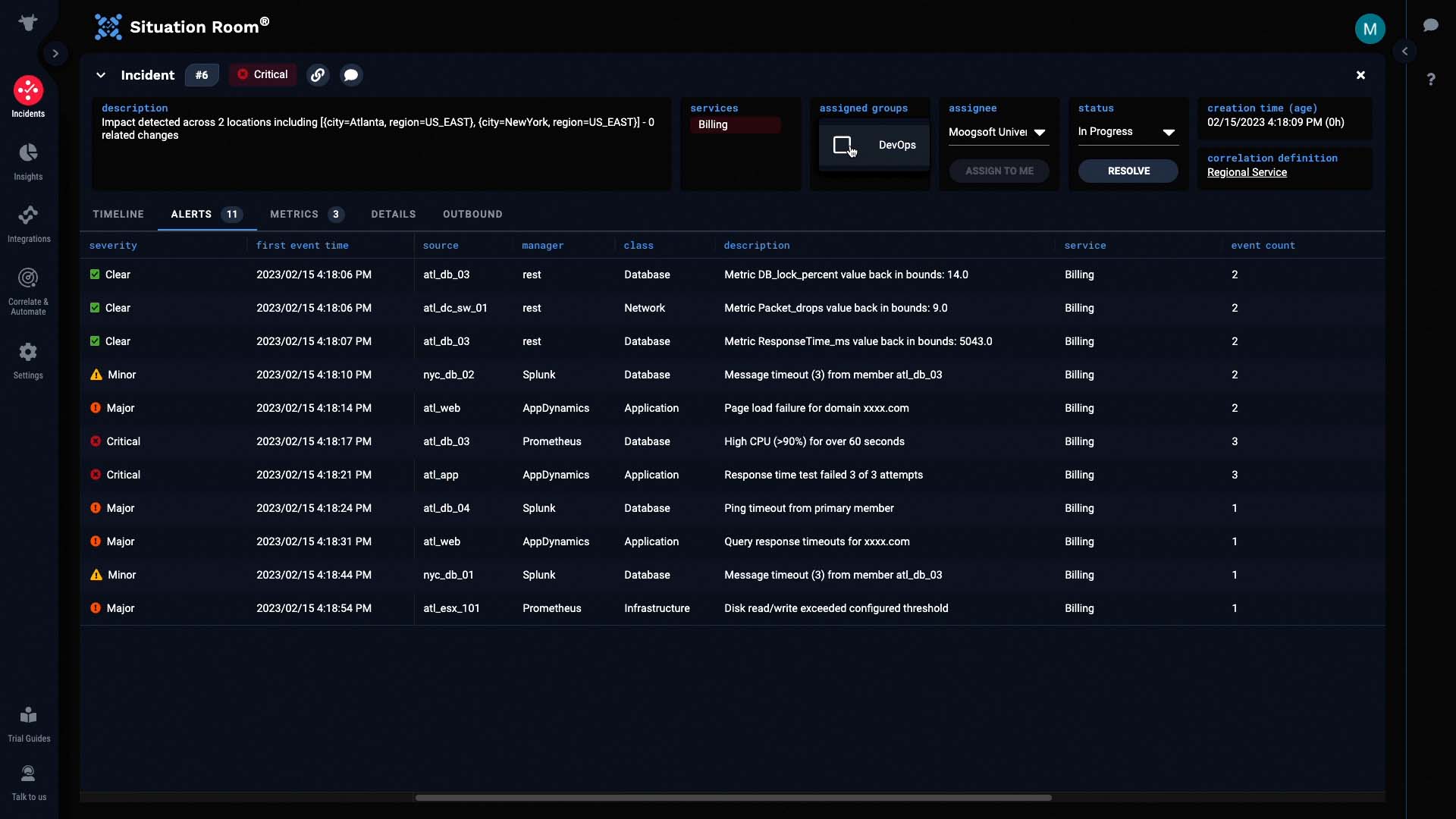
We are going to own this incident, and assign it to our group.
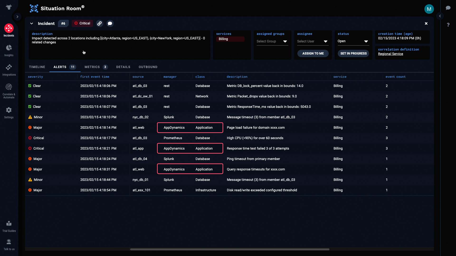
Now let’s examine the alerts.
We’ll sort these alerts by First Event Time so we can see how the issue started, and how it evolved.
You can see in the Manager column how this incident combines alerts from four different data sources.
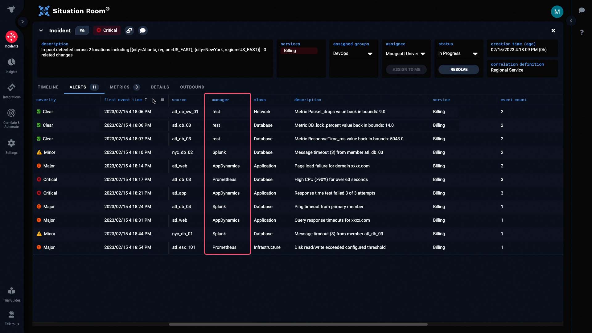
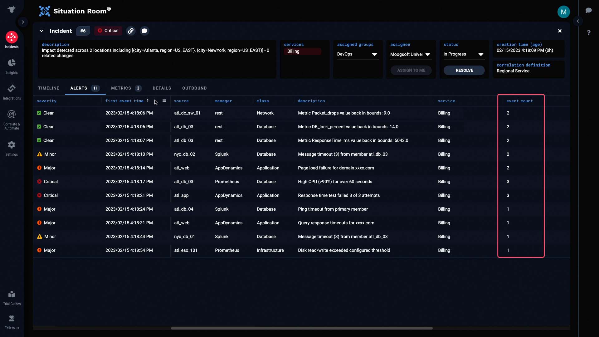
And under event count, you can see how Moogsoft provides noise reduction by deduplicating events into alerts.
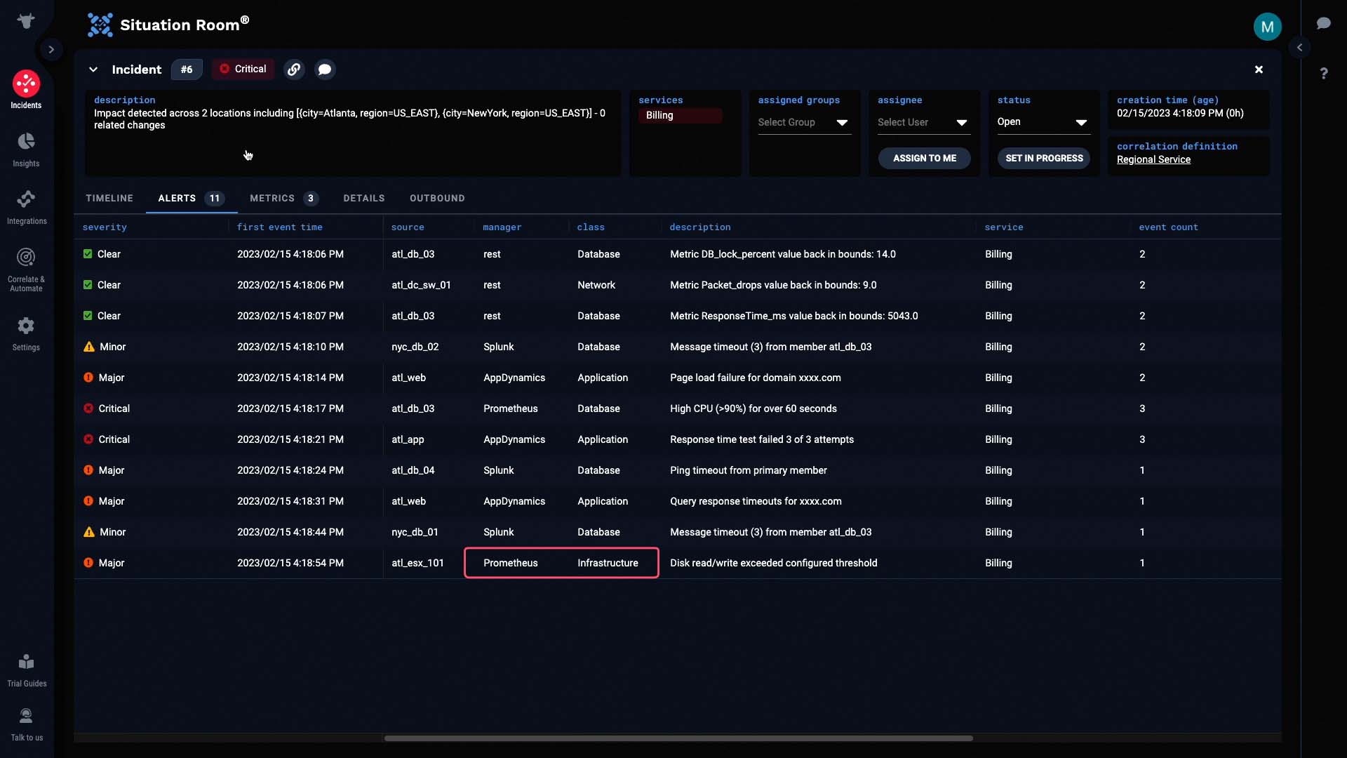
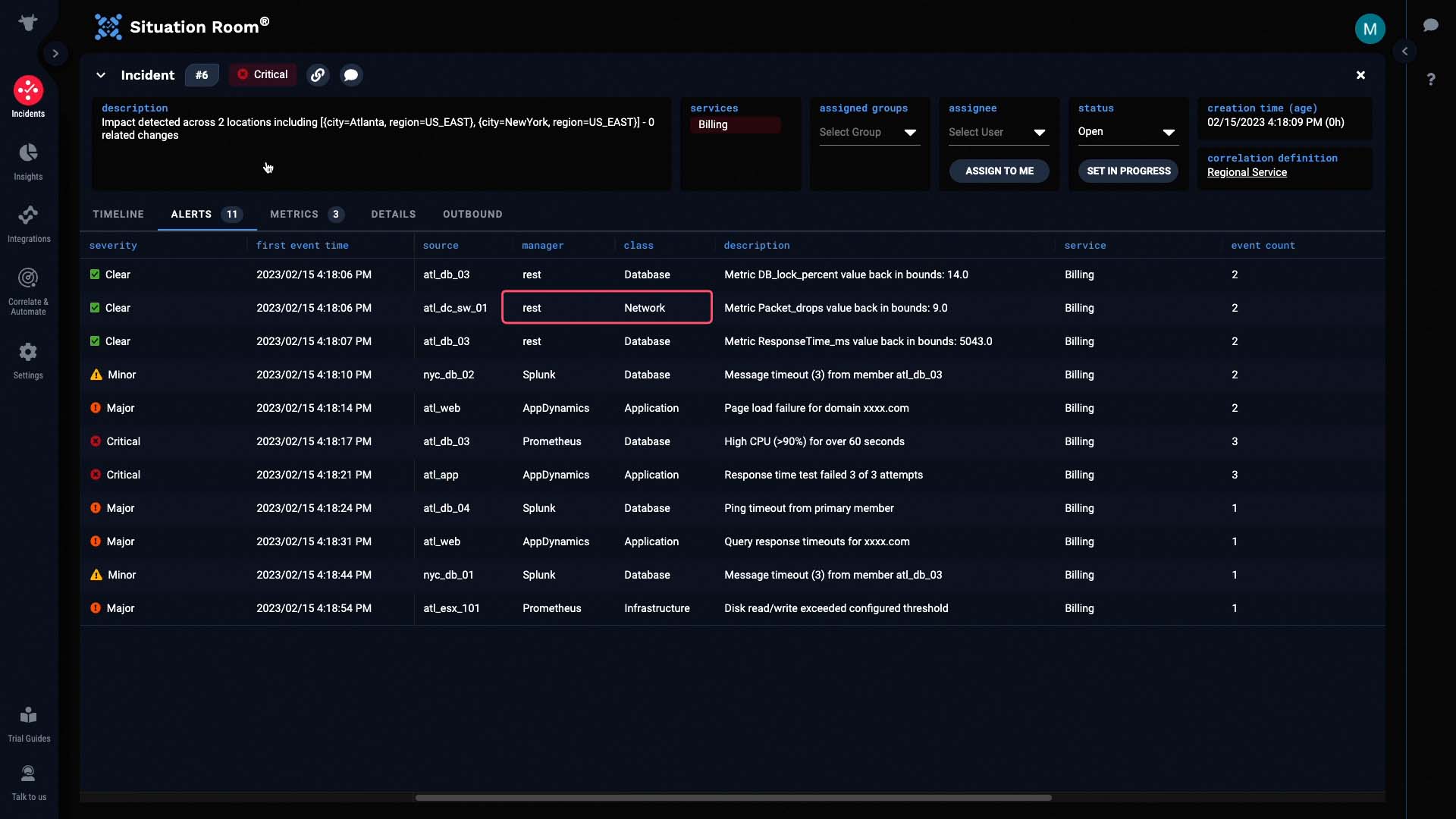
Now let’s look at the individual alerts.
The very first alert came from a switch in the Atlanta data center. It looks like the packet drops went out of bounds.
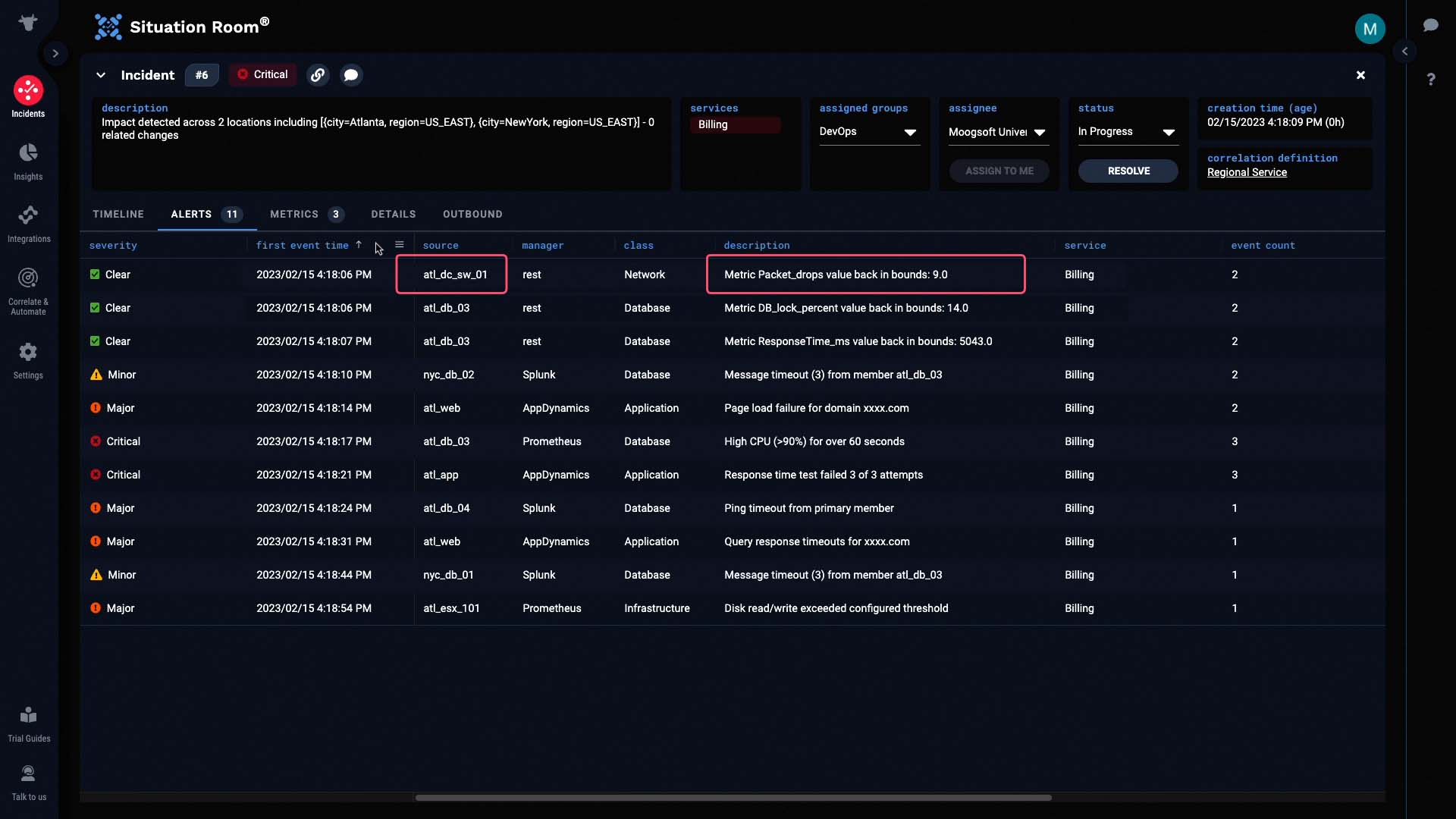
Only a few seconds after this alert was created, we began receiving additional alerts about database timeouts...
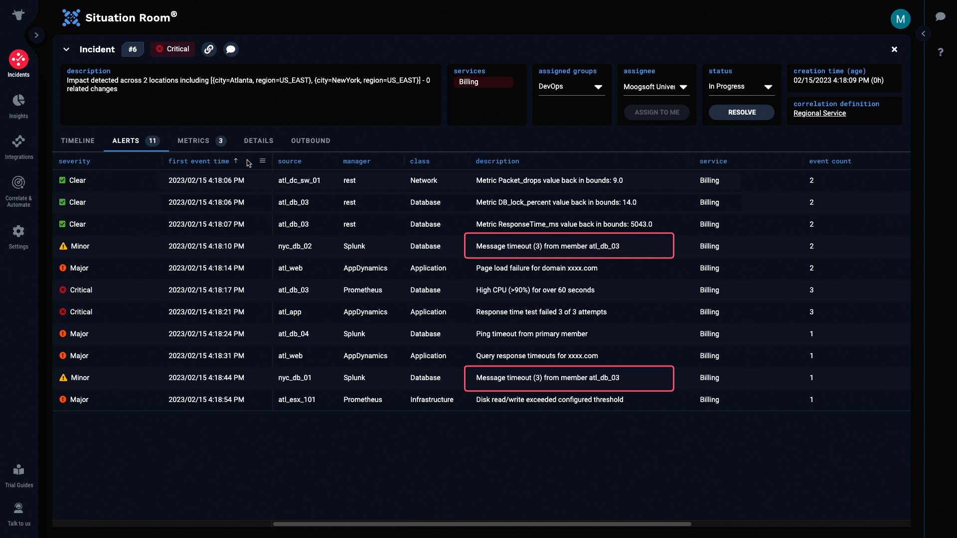
Application page load failures...
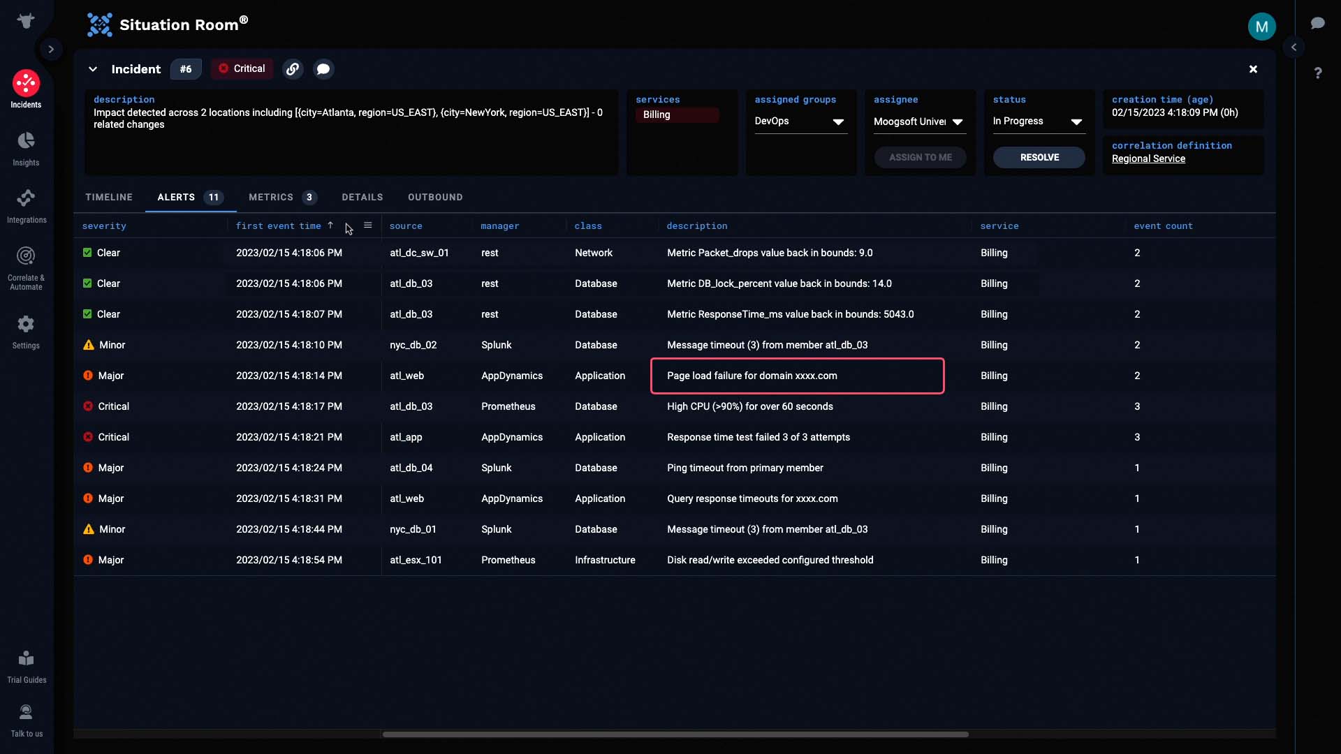
And various other issues.
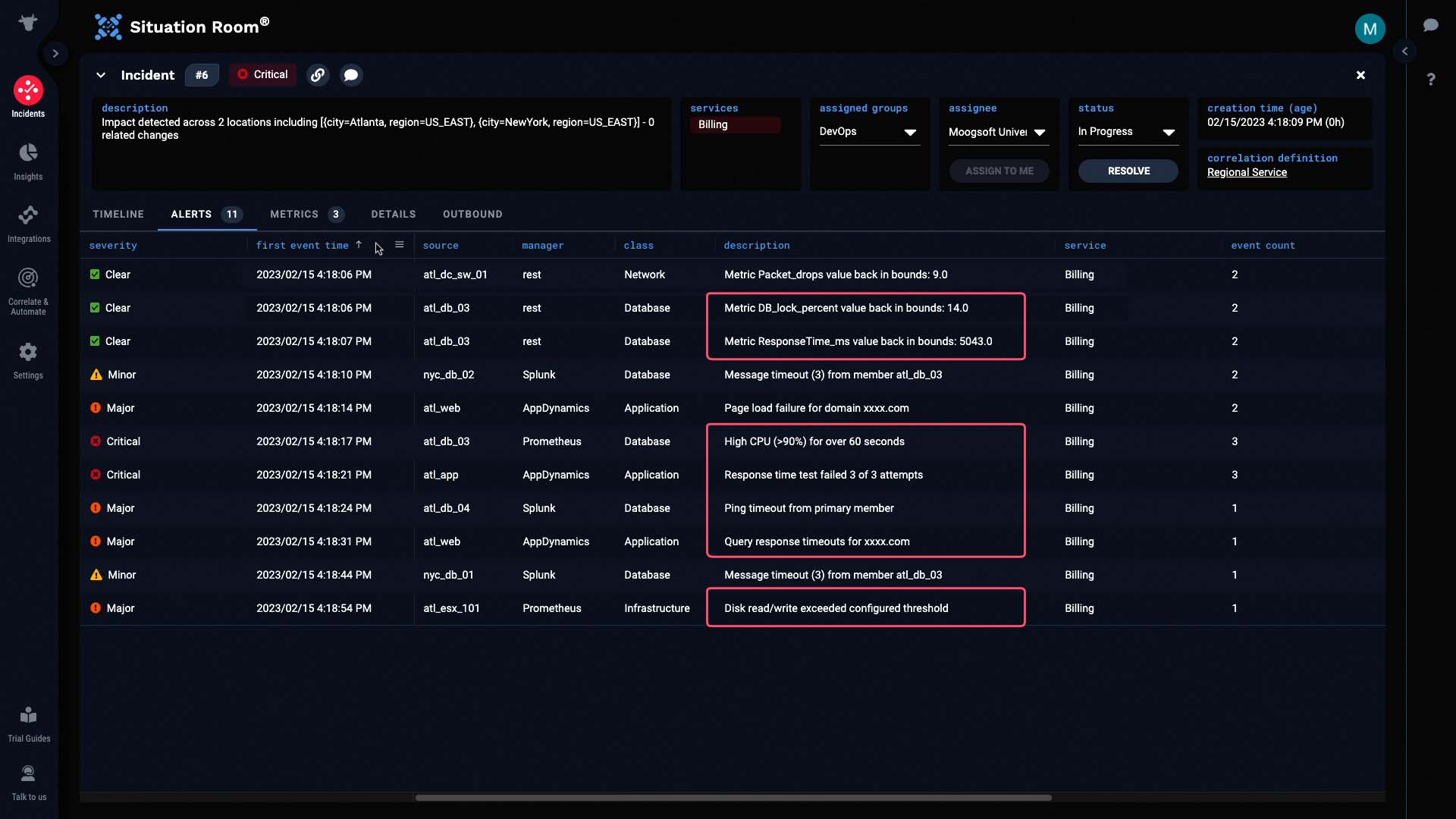
So from this, it seems that the packet drop alert might be the root cause behind this incident.
Let’s do some further investigation by looking at the metrics for this incident. We’ll only examine relevant data from the past hour.
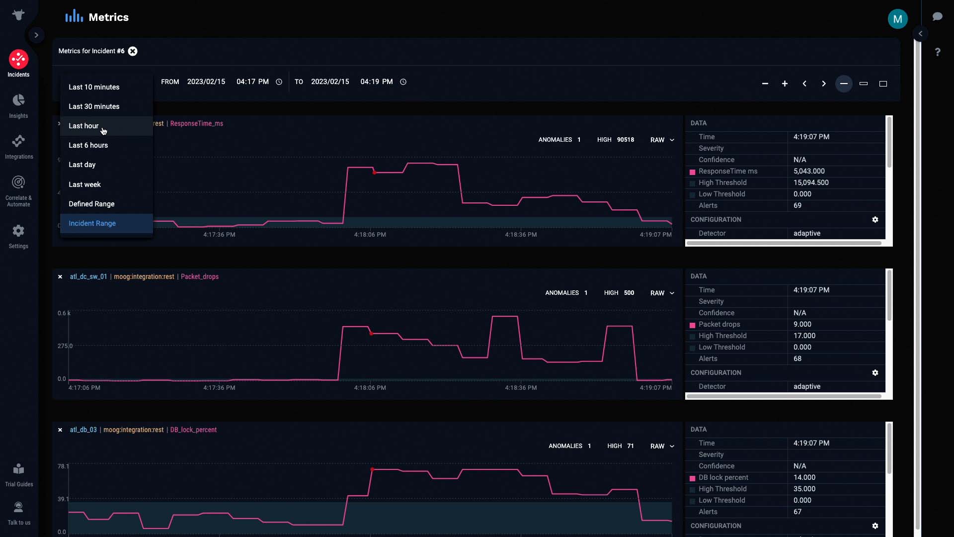
For each of these metrics, the pink line represents the raw values of the metric at any given interval. The light gray band in the background represents the normal operating range of the metric, as calculated by Moogsoft.
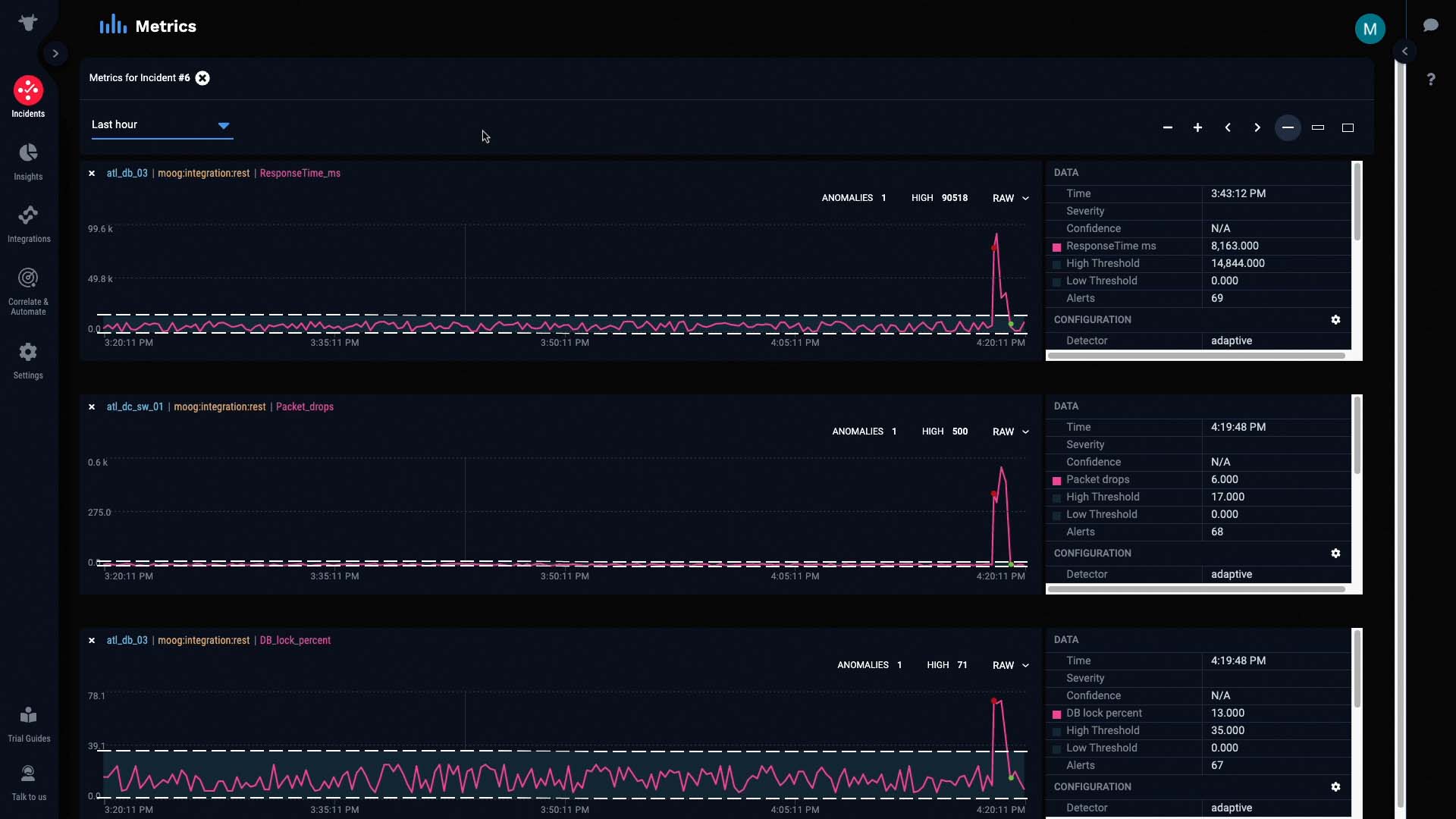
And these colored dots represent anomalies in the metric that Moogsoft has detected and classified, in terms of significance.

As the metric continued to stray out of bounds, the anomaly was classified as Critical...
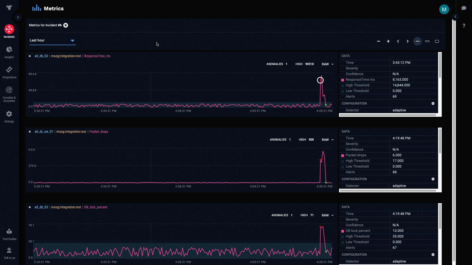
And was later cleared when the metric went back in bounds.
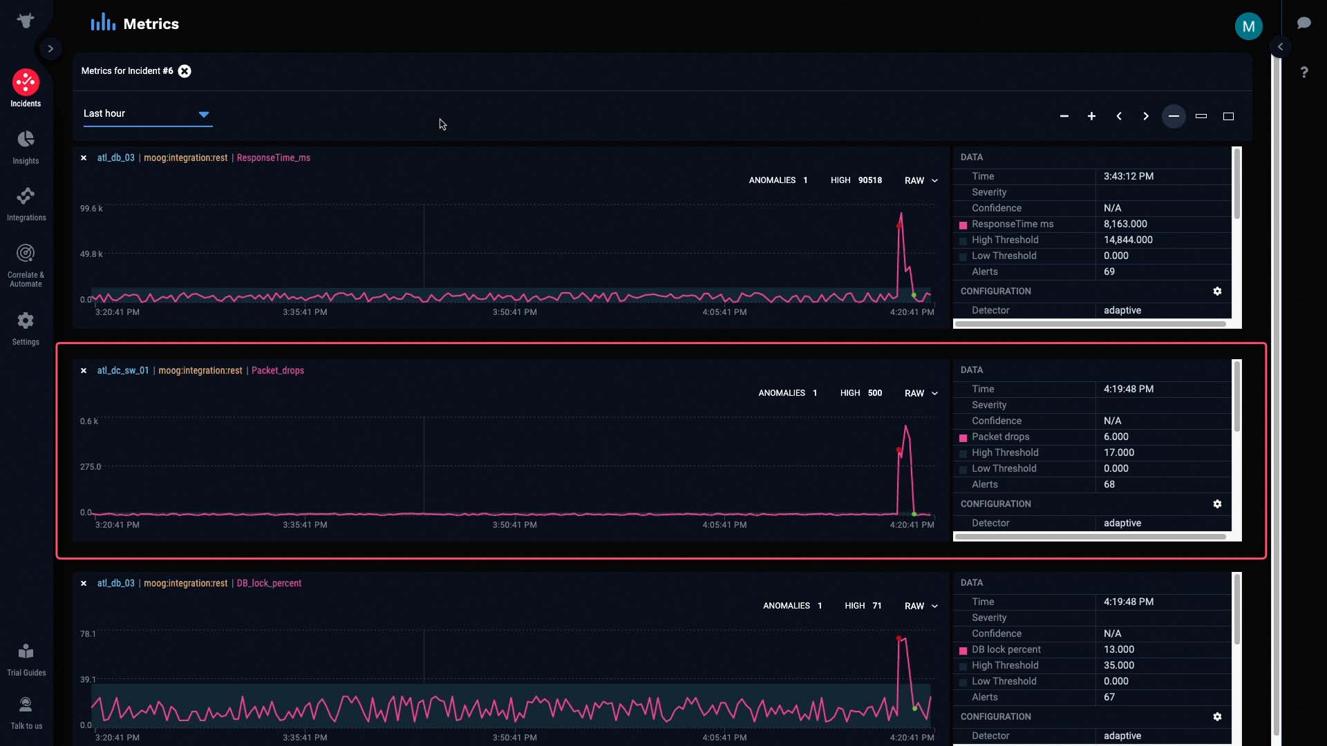
This metric is the packet drops alert we talked about earlier. Let’s see if it’s really the underlying cause of this incident.
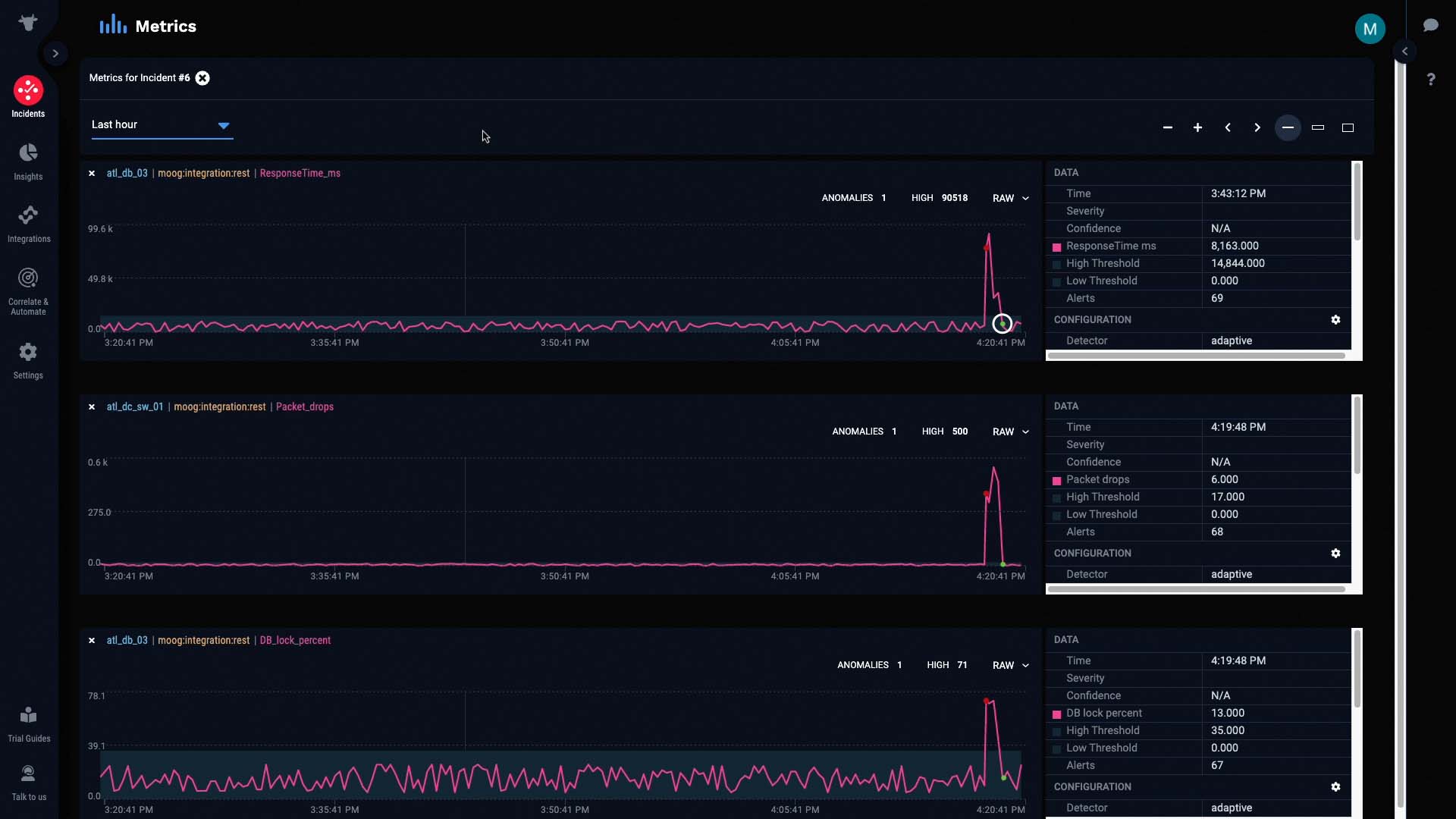
If we compare this graph to the graphs of the other alerts, we can see that all the anomalies started as soon as packet drops were detected...
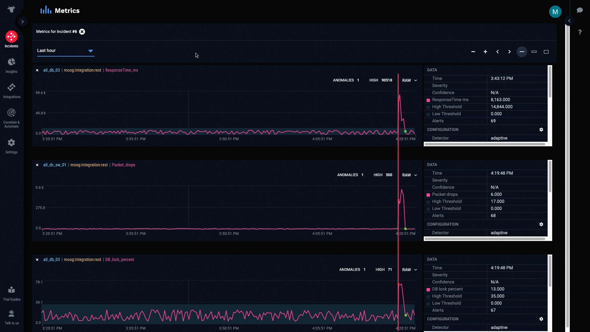
And more importantly, all the anomalies were cleared as soon as packet drops were cleared.
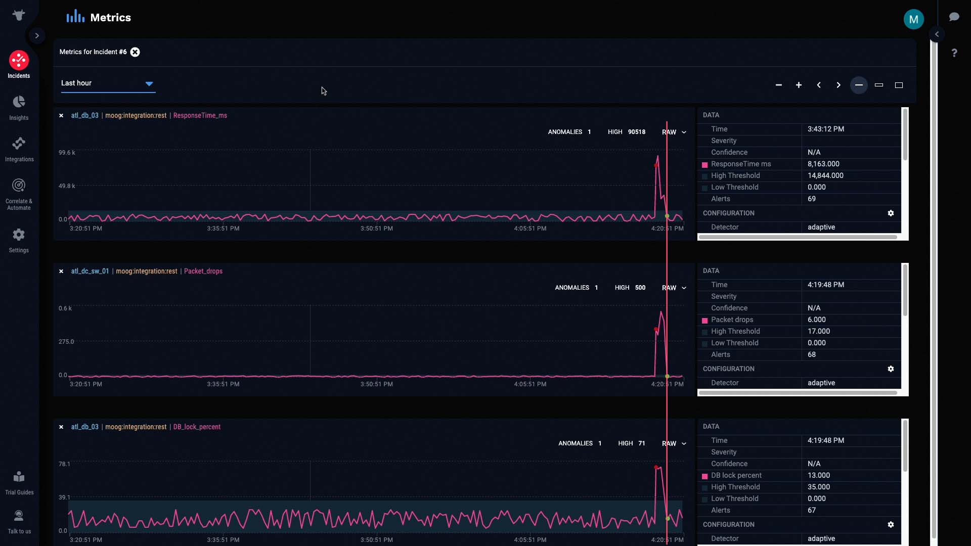
This is a pretty good indication that our hypothesis is correct. The packet drop issue seems to be causing all the other alerts.
With this figured out, we know exactly who we should talk to about next steps. We’ll notify the team responsible for maintaining our network, and ask them to check on the faulty switch in the Atlanta data center.
Imagine how much time we’ve saved just now by having all the info from separate source systems in one place, and having them grouped together based on their relatedness for you. Now you know how you can have Moogsoft correlate alerts for you for a faster mean time to recover.
Thanks for watching!